The Internal Communications Data Storytelling Guide

This post was developed in partnership with our friends at Brilliant Ink, featuring content from a recent webinar by Brilliant Ink’s Jackie Berg, Head of Research & Business Development.
Your leadership team asks you for the numbers on a recent employee email campaign.
You pull the metrics.
You check the charts.
Then, you scratch your head and ask yourself: wait, what is going on here?
What is the story?
Is there even a story?

Sooner or later, every internal communications professional will have to work with data.
Whether you’re a master of measurement or you’re mystified by internal comms metrics, knowing how to present and tell the story of your data is the most powerful way to demonstrate the effectiveness and influence of your internal communications.
But the perfect story isn’t always in plain sight and analyzing data is probably not something you’re used to.
If data analysis or numbers intimidate you, don’t worry—you have everything you need to be an awesome data storytelling master already.
You just need to know how to harness it.
That’s why we put together this handy guide to help you recognize your data storytelling skills and unlock the power of your internal comms data.
Table of Contents
Why is data storytelling important in internal comms?
Data is an increasingly important part of measuring the employee experience.
Whether we’re looking at email open rates or measuring employee sentiment with pulse surveys, data can help leaders make informed decisions.
But when presented with a bunch of numbers, it’s hard to discern what information is important, what they really mean, and what decisions should be made.
Stories help cut through the noise and help us focus on what’s important.
The truth is that data storytelling is an essential skill—now and in the future. It’s another form of literacy and a huge asset in the workplace.
Miro Kazakoff, a leading lecturer in communications and data storytelling at MIT’s Sloan School of Management, puts it best:
Being literate with data and able to explain the stories it reveals is as important a form of literacy as being able to read, write, and speak clearly. It’s a core skill, not a job function, and it cuts across all divisions and roles at a company.
Why communication professionals are the best data storytellers
Interpreting data was once reserved for data scientists. Although data scientists are skilled at collecting and analyzing data, they often lack the skills of storytelling and tailoring their findings to different audiences.
Communications professionals, on the other hand, bring essential skills to the table. You know how to distill complex information for a general audience and get key messages across—all while wrapping it up in a captivating, persuasive narrative.
At its core, data storytelling is communication.
And when done right, it’s pretty powerful.
Effective COVID-19 communication is data storytelling
We’ve seen the immense impact of communication professionals and data storytelling throughout the COVID-19 pandemic. The most effective public health communication efforts around COVID-19 combine a clear presentation of data with a captivating narrative arc.
That’s because communications professionals know that while statistics are important, people make decisions based on emotion.
And the best way to communicate emotion is through stories.
What does that look like in the case of COVID-19?
The success of the “Flatten the Curve” chart is an example of communicating data in a compelling narrative.
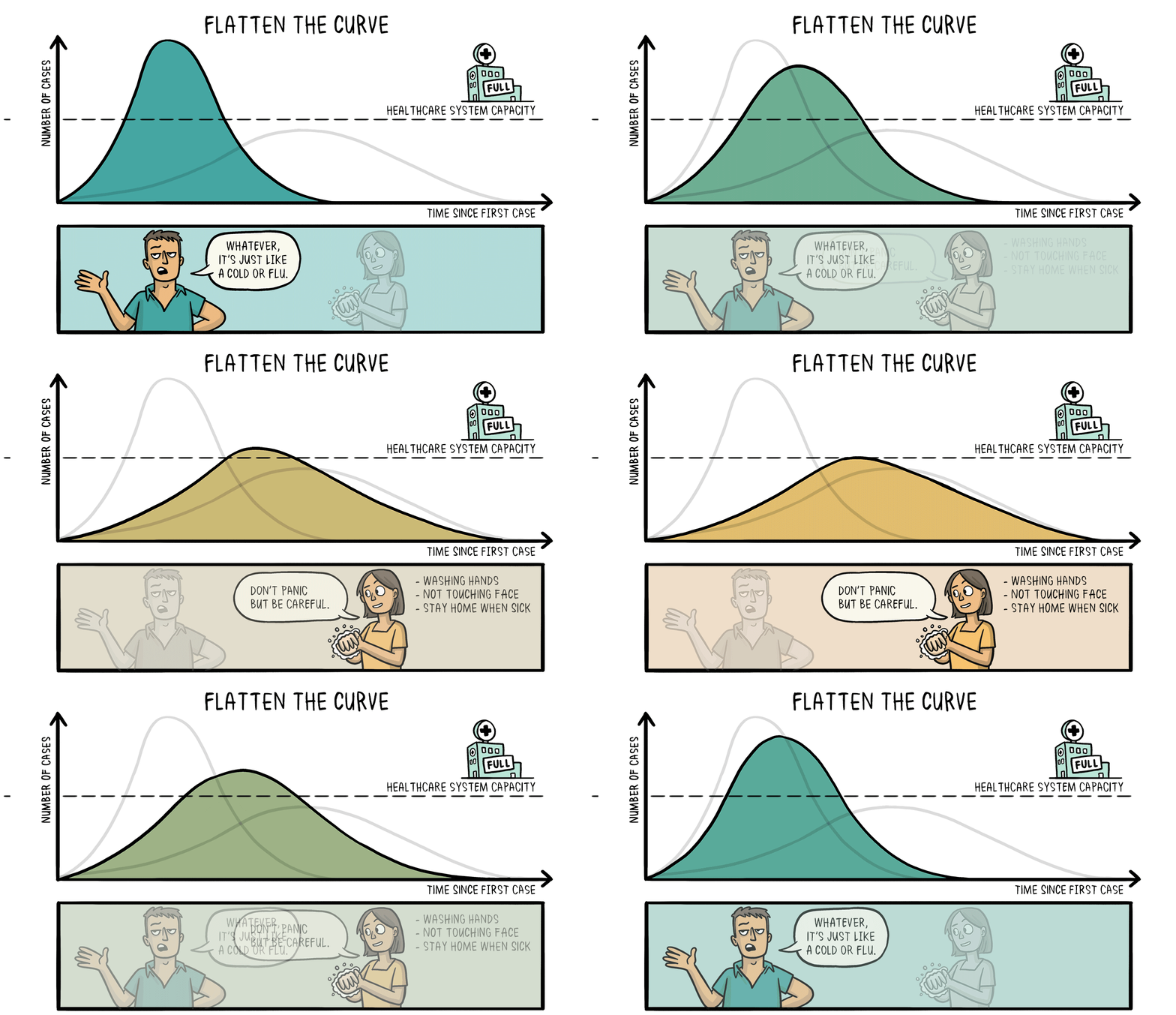
Originally used among healthcare experts, this public health chart has been adapted from a scientific journal for news outlets and social media so that it resonates more with the general public. It shows how measures like social distancing and handwashing can contain the spread of the virus and keep infection rates low enough for healthcare system capacity.
And, when communicated effectively, this chart can also positively affect behavioral changes to actually flatten the curve.
The data in itself is powerful, but without the story, people wouldn’t understand why it was important and it would be less likely to influence them.
This is just one instance of the power of data storytelling in our everyday lives.
When done right, data-fueled stories grab our attention, stick with us, and influence our behavior.
So let’s dig into how you can become a data storytelling master.
Warning: A dashboard is not a story
We’ve all been tempted to snap a screenshot of our analytics dashboard, plop it into a PowerPoint, and say, “Look at how successful our campaign was!”
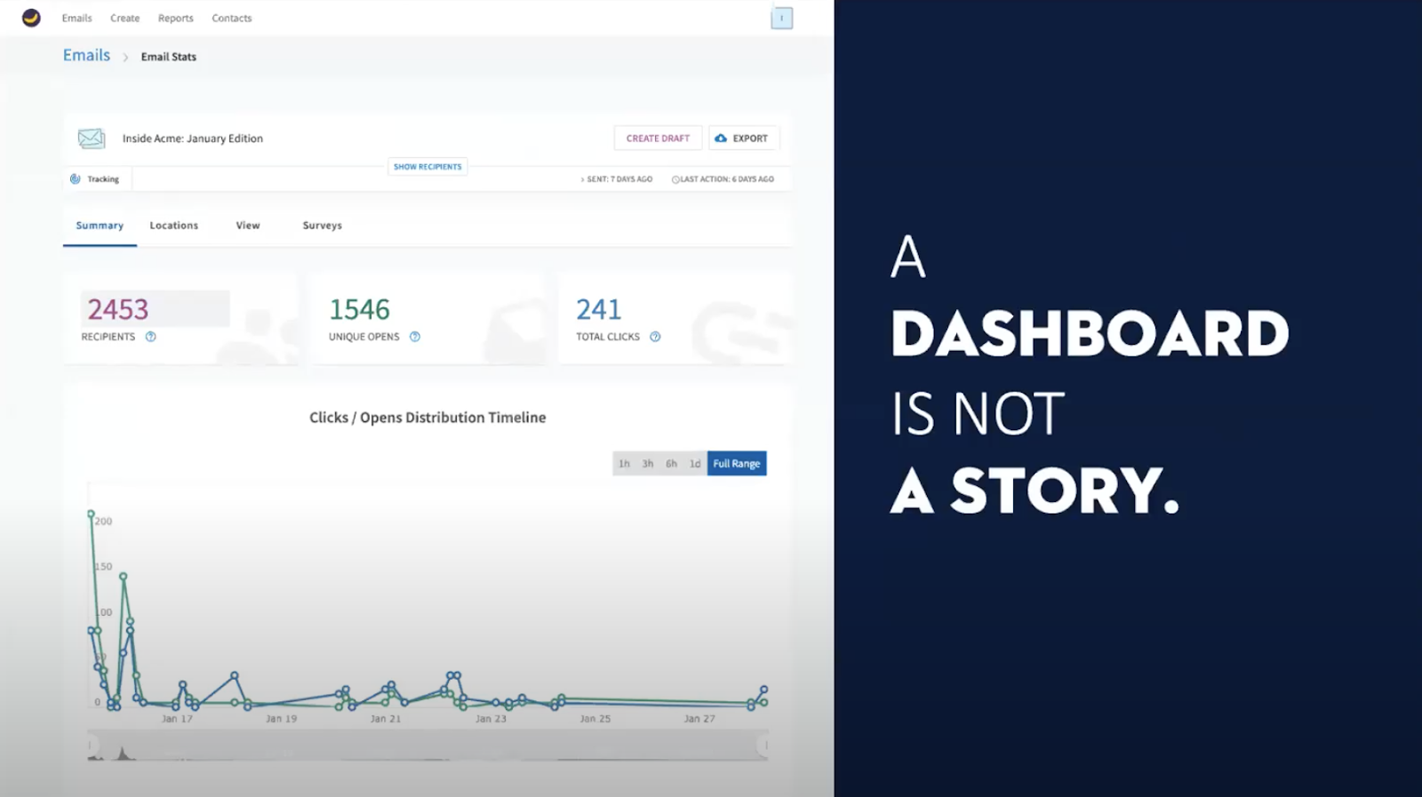
But as nice as dashboard stats might be, they’re just one piece of a bigger picture.
And they don’t really tell a compelling story, at first glance.
That’s because a dashboard can tell you what is happening—but it does not tell you why it is happening.
Data cannot stand on its own, especially if you’re building an argument or a business case. Data needs to be put into context for your audience so that it’s memorable, persuasive, and engaging.
To paint that bigger picture, you need to dig deeper into the why.
How to interpret internal comms data
Ask the right questions
Looking at the data in front of you can feel pretty overwhelming.
Where do you even begin?
Before you dive in, take a moment to step back and be curious. Jackie Berg, Head of Research & Business Development at Brilliant Ink, gave us some awesome advice in the Creating Stories from Numbers webinar. To make sure that you’re getting the strongest story possible, ask yourself the following questions:
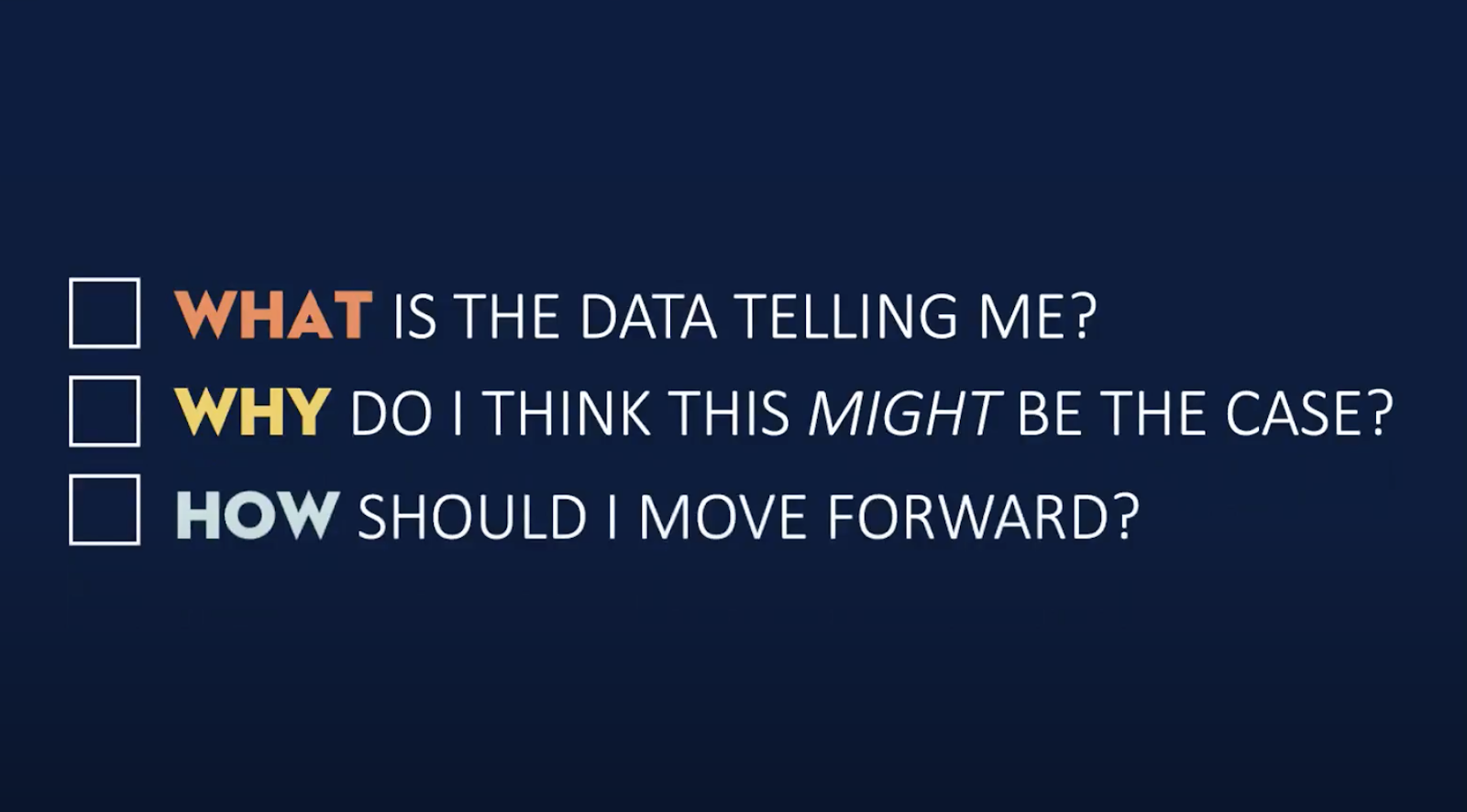
The answers to these questions will help you uncover the story.
Visualizing the data will help analyze the data
The cool thing about data visualization is that you don’t have to know the story before you start.
Unless you’re a data savant, looking at a bunch of numbers in a report probably won’t get your wheels turning.
Playing with the data visually by plugging it into various charts or other visual representations will help to illuminate what is really happening, and often, the story will reveal itself.
So here’s how to start visualizing and analyzing your data, so you can create a compelling presentation:
Step-by-step data visualization process
1. Choose the right charts
Instead of standing alone, charts should complement your presentation and be easy to read.
Jackie says that any data visualization should pass the “glance test”
I want my audience to glance at a chart for two to three seconds max and get the main point. Especially if I’m presenting the data, I want them to turn their attention back to me.
Jackie Berg, Brilliant Ink
You want your audience to focus on what you’re saying rather than spending their energy deciphering a chart.
Pie charts, for instance, don’t pass the glance test. The angles are hard to read, the values are close together, and you’re forced to include a detailed key or legend so that your audience can make sense of it all.
Plus, if your stakeholder is color-blind, or someone prints out your report in black and white, your story is gone.
Moral of the story: choose your charts carefully and don’t use pie charts.
2. Clean your charts so they pass the ‘glance test’
To make sure your chart passes the glance test, take a look at the grid lines on the horizontal axis (the X axis).
In this example, you’ll notice that there are grid lines and tick marks at every 10%:
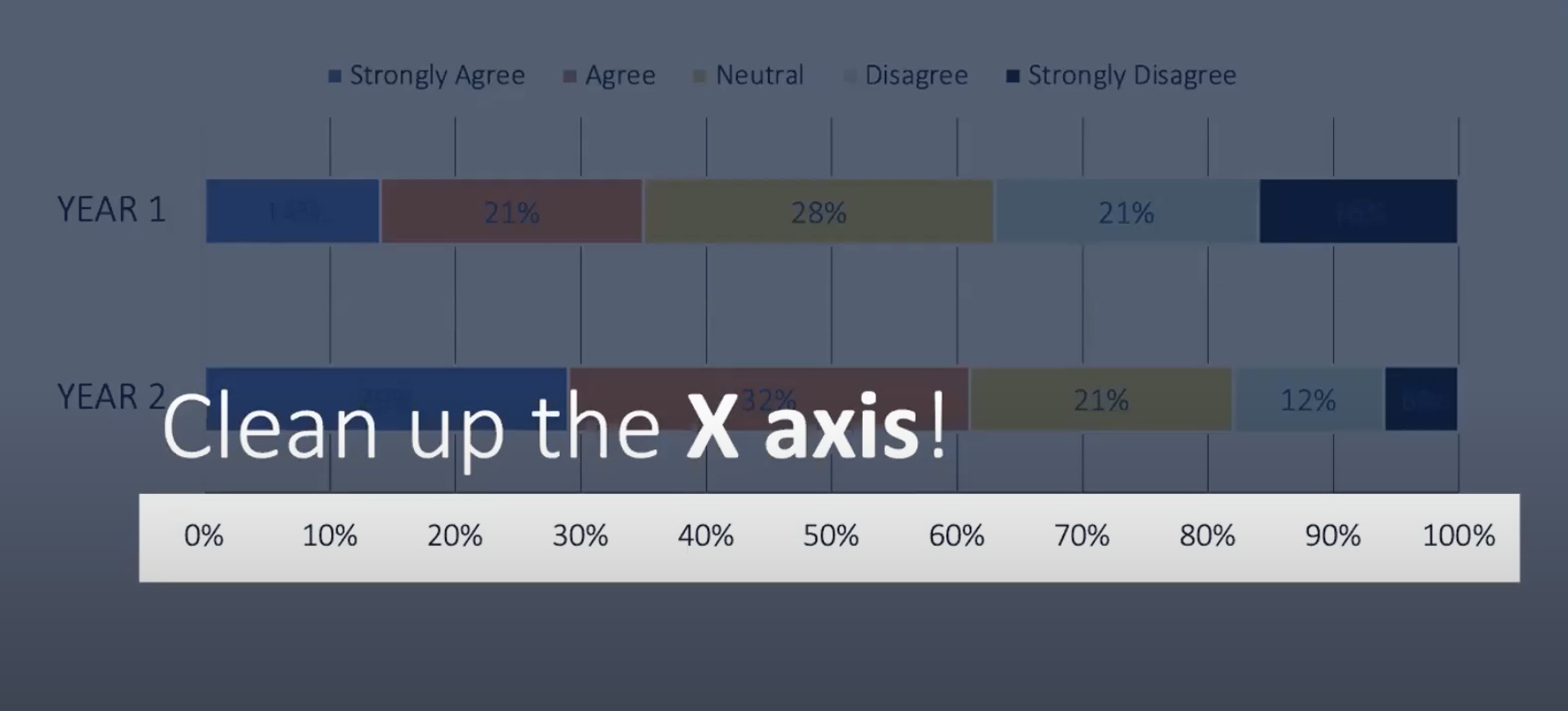
This chart looks pretty busy as a result.
The general rule for grid lines is to aim for a maximum of 3 to 4, like this:
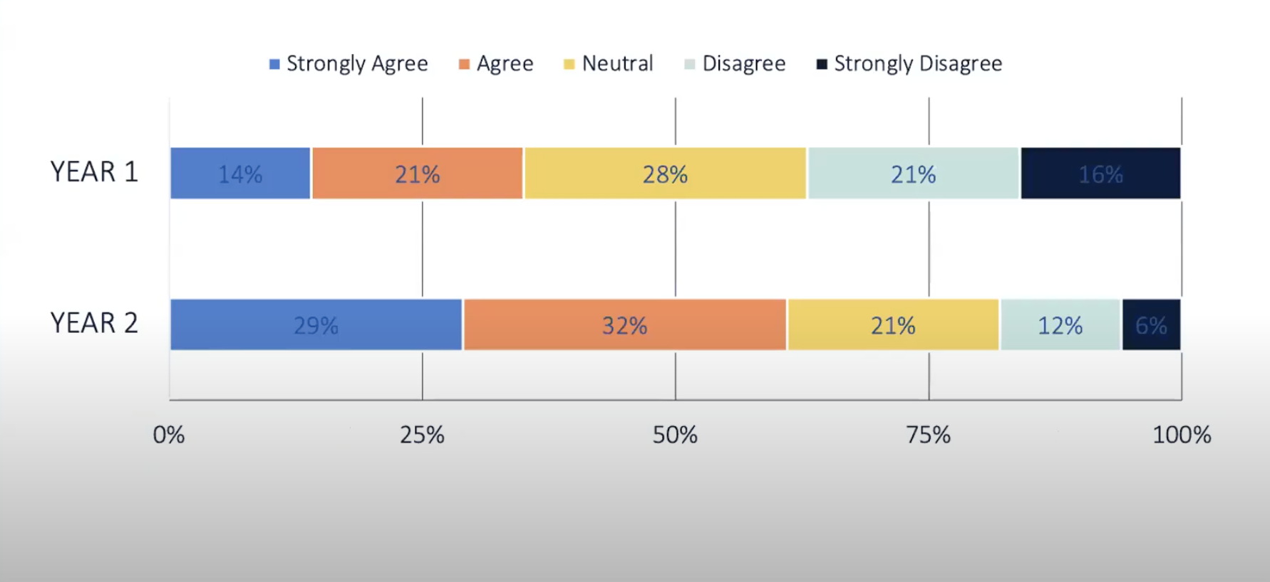
By reducing the grid lines and simplifying the X axis to mark increments of 25%, this new chart is already less busy and easier to read.
You’ll also see that Year 1 and Year 2 now stand out to the reader and are easier to distinguish. Making the descriptors on the vertical axis (or the Y axis) bold make this chart easier to read.
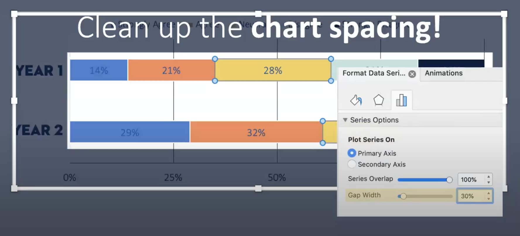
Next, you’ll want to clean up the chart spacing.
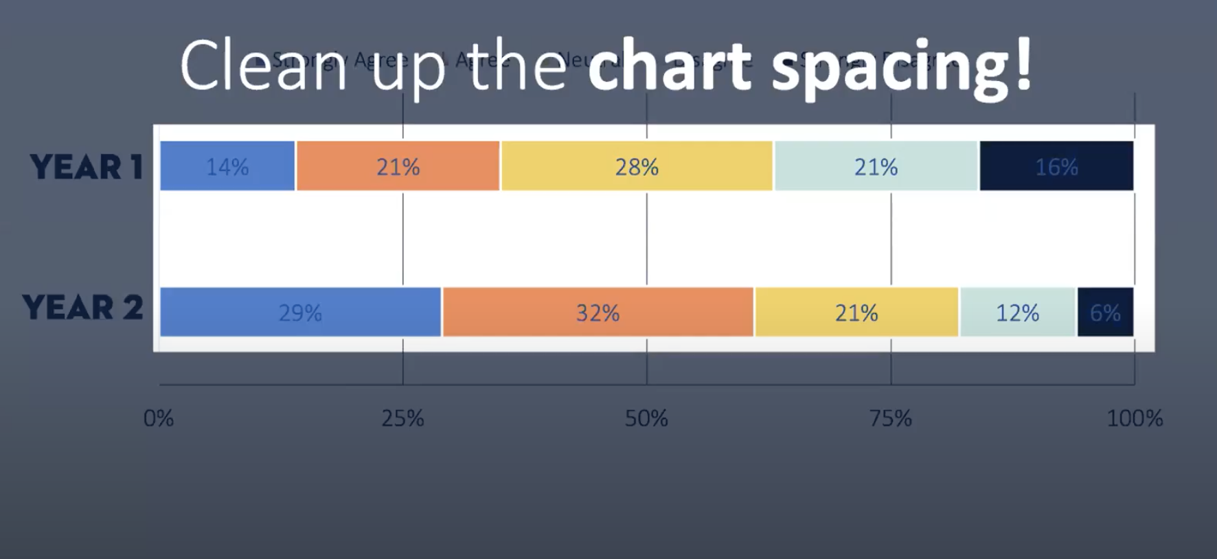
Reduce the amount of space between these individual bars to make it easier to visually compare one data point to the next:
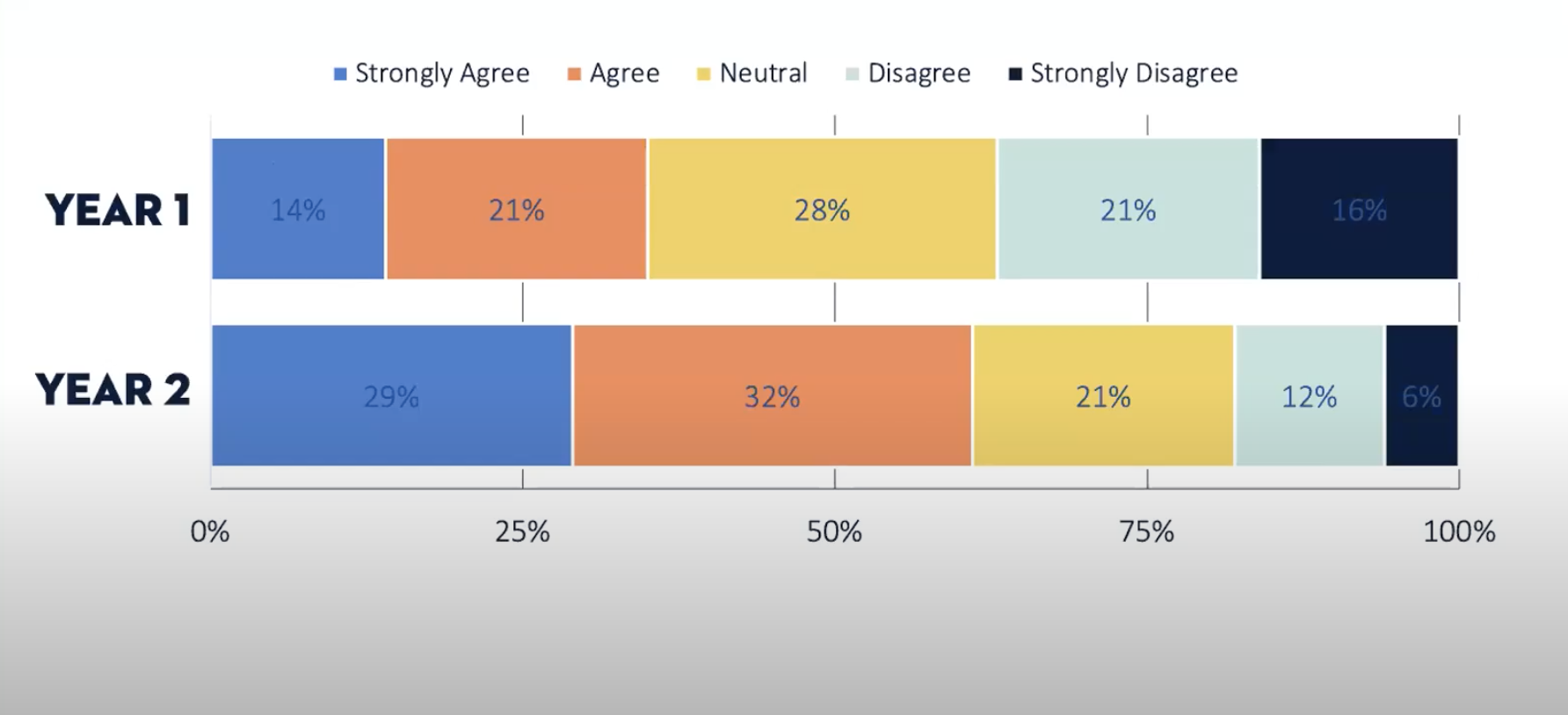
You can do this in PowerPoint by clicking on the chart, opening the Format panel, and adjusting the gap width:
Then, you’ll want to clean up your chart legend.
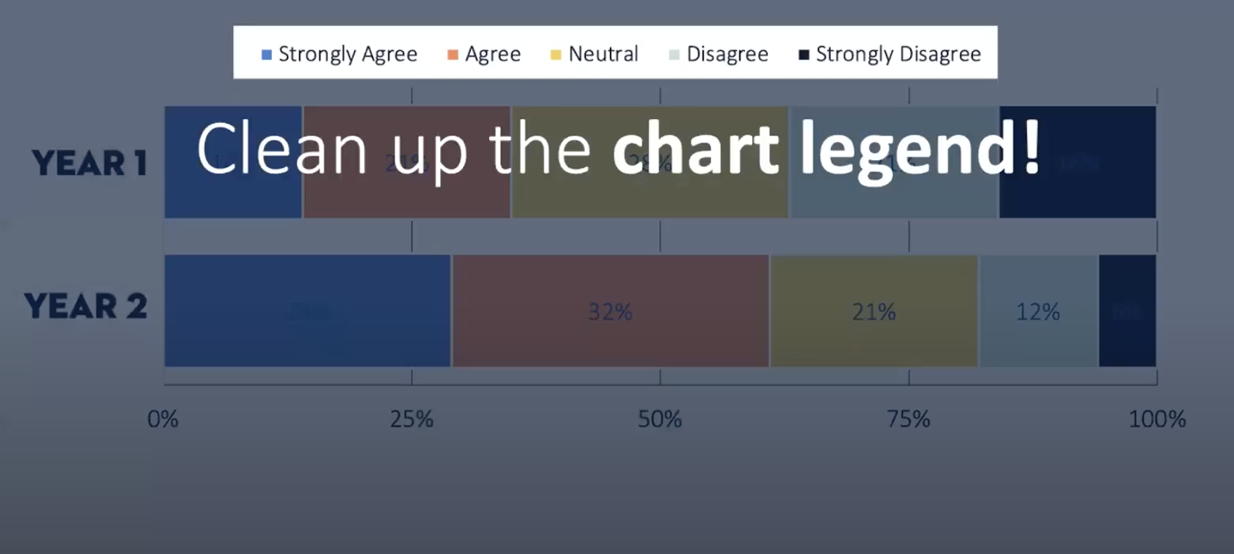
Right now, the way this chart looks, the legend is too much to read in addition to all of the other information.
Jackie recommends changing this into a table instead:

Now you’re ready to adjust the color to really make your points pop.
3. Use color and contrast strategically
Before adding color, Jackie recommends removing all color to create a blank slate. This is so you can figure out how to make your main points shine and stand out.
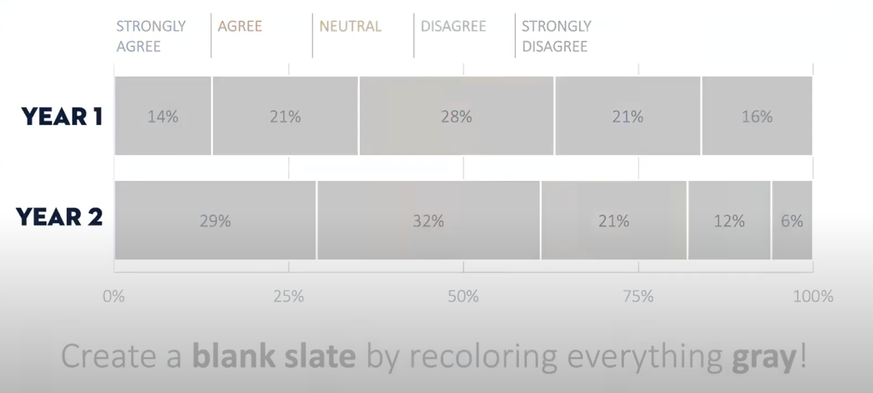
With more presentations taking place virtually over Zoom or Microsoft Teams, emphasizing your main points visually is critical to getting your story across.
Contrast is an effective way to do this.
Use a bold color to highlight those main data points. You’ll want to make sure they jump out in the midst of all that grey.
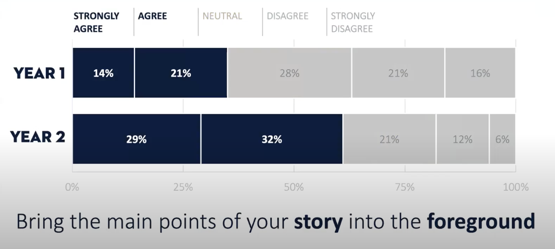
Then, you can play around with the colors to get a color combination that will really stand out.
When you use a high contrast background, your audience’s eyes are immediately drawn in—like this chart, with a navy blue background and yellow highlights for the main points:
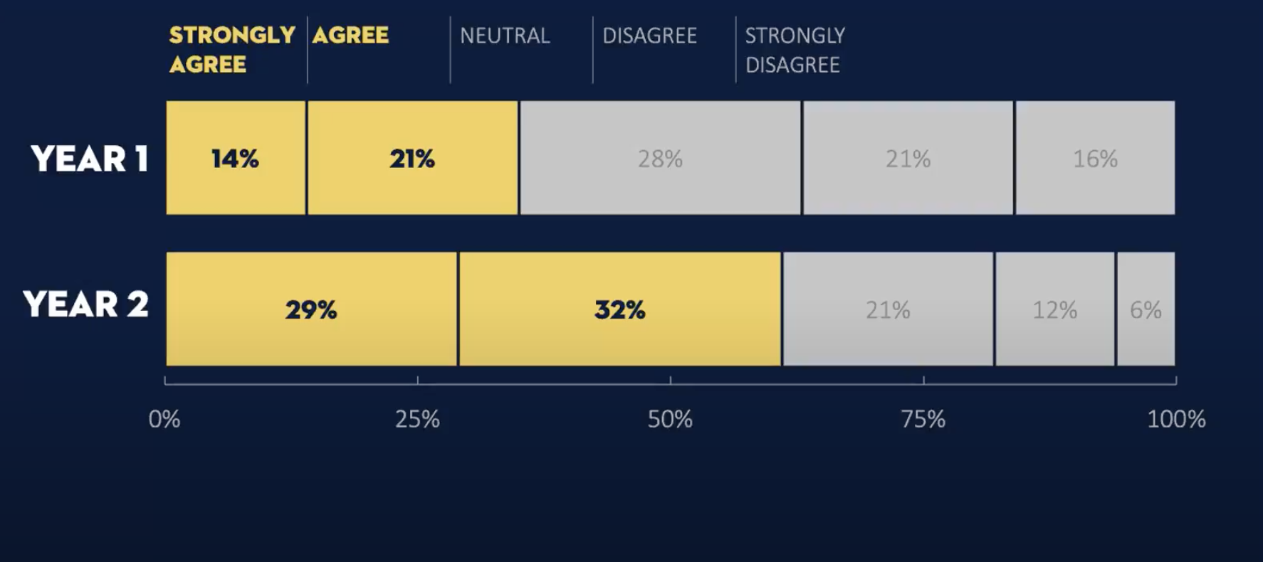
With contrast like this, the story you tell will be memorable and easy to decipher.
Want to highlight something really important?
Save high contrast slides for when you really want to emphasize a point and drive your case home.
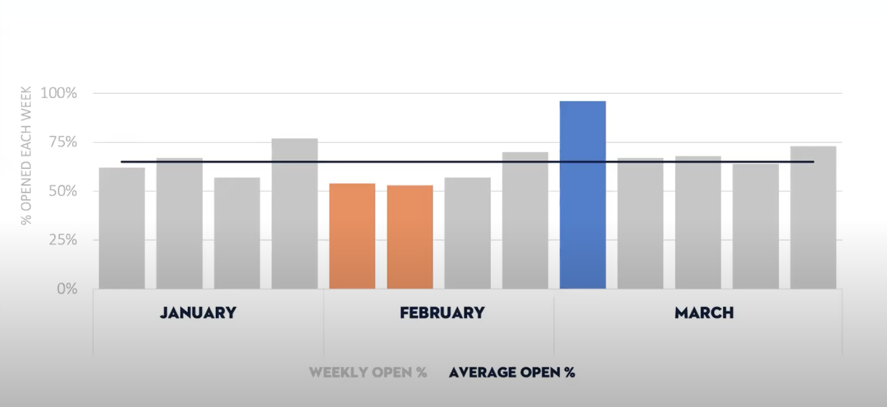
For example, let’s say you want to highlight a key email metric, like the highest open rate you’ve had in the last few months. You can use one color to draw attention to that exceptional open rate:
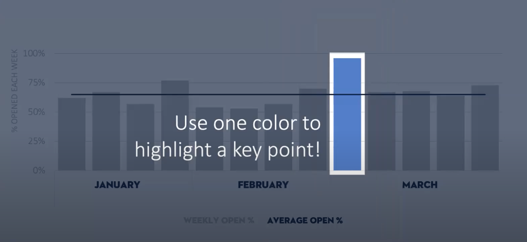
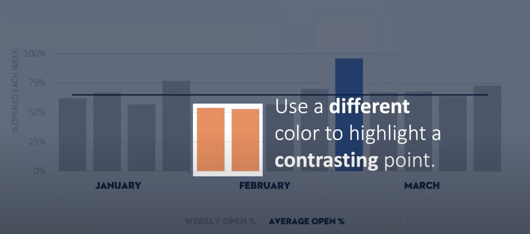
Then use a different color to highlight a contrasting point, like the lowest open rate.
Use these low and high data points to build your story. The narrative will become more apparent when you visually draw attention to opposing data points.
4. Title your slides
Jackie says that slide titles are “extremely precious real estate.”
Your slide title is your one shot to sell the overall narrative of your data. Your audience needs to be able to read and understand it quickly.
This is the place for you to spell out: “What is the data telling me?”
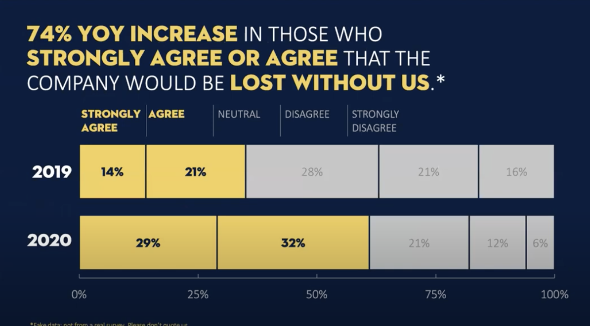
Although this chart is a fictional example, the title complements the data and is also highlighted with punchy, bold yellow text to stand out.
Just like that, your chart visualization is complete.
The data story, however, is not.
You’ve grabbed your stakeholders’ attention—but now you have to keep their attention and make your case.
5. Context
Now it’s time to ask: “Why does the data look like this? And why do I think this might be the case?”
Context is key to bringing all of your hard work together and making your case.
It’s time to connect the what to the why.
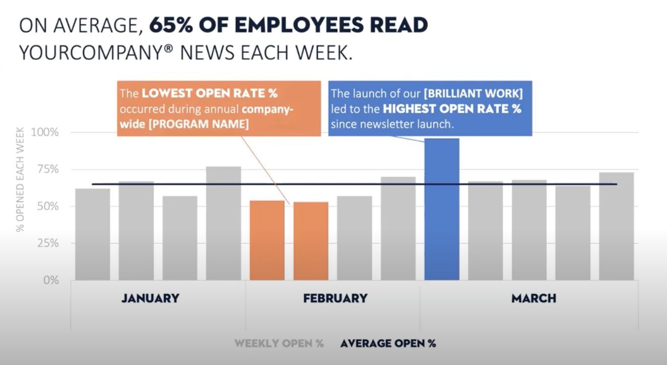
What did you do in the last year that positively impacted your survey results? Why are your email open rates higher in March than in February?
Maybe you implemented a tool like Staffbase, or ran a successful employee engagement campaign. Whatever the case might be, this is your opportunity to show how the numbers relate to your internal comms efforts.
When you add context to your data, the story comes to life.
In the case of email open-rates in this chart, for instance, you can connect the numbers to specific email campaigns or launches:
To really emphasize the difference that a particular campaign or launch made, highlight the key findings in text boxes with the main takeaways in bold:
6. Make your case
So you’ve shared the data and results. Your stakeholders are leaning in, their interest is piqued.
But guess what?
Results like these didn’t just happen by accident or coincidence. This outcome is because of your team’s hard work.
And this isn’t time for a humble brag—this is your time to show off.
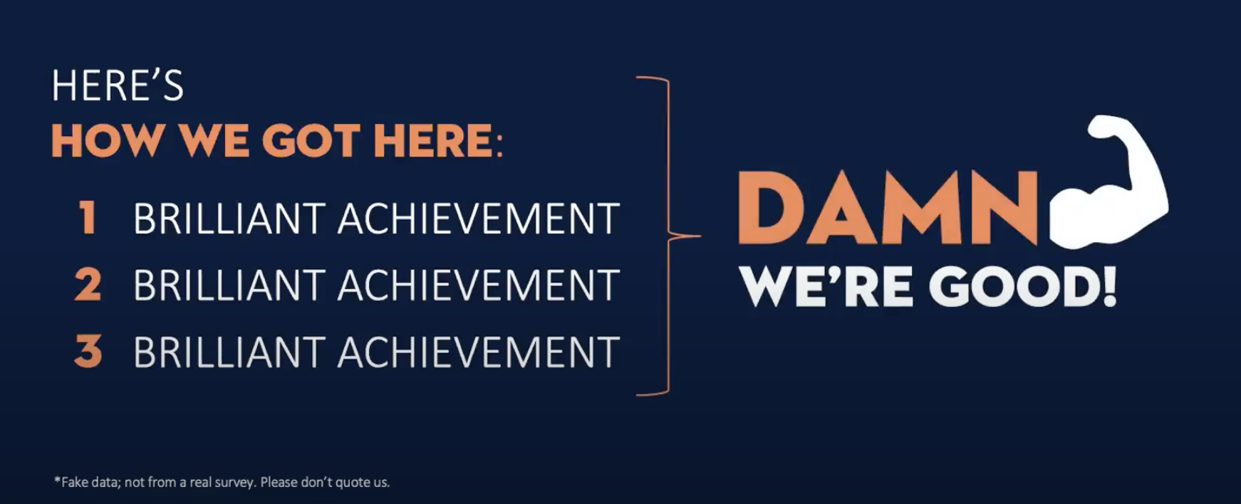
Or, in the words of Jackie: “This is a ‘Damn we’re good! and we have the data to back it up’ kind of a brag.”
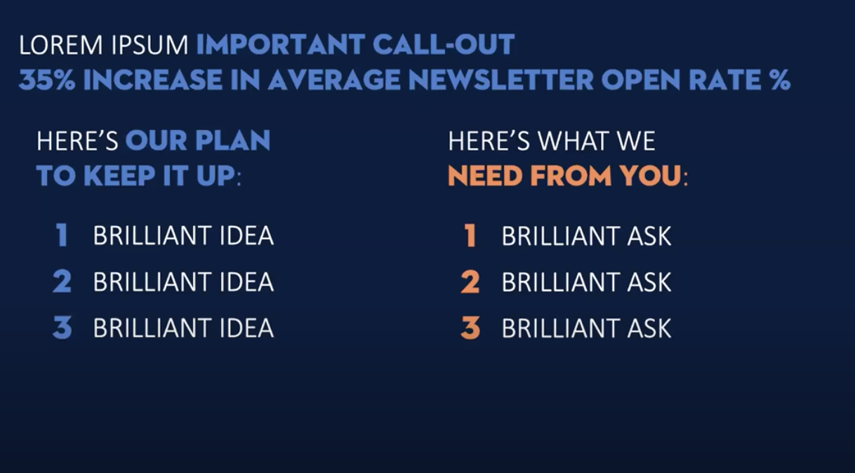
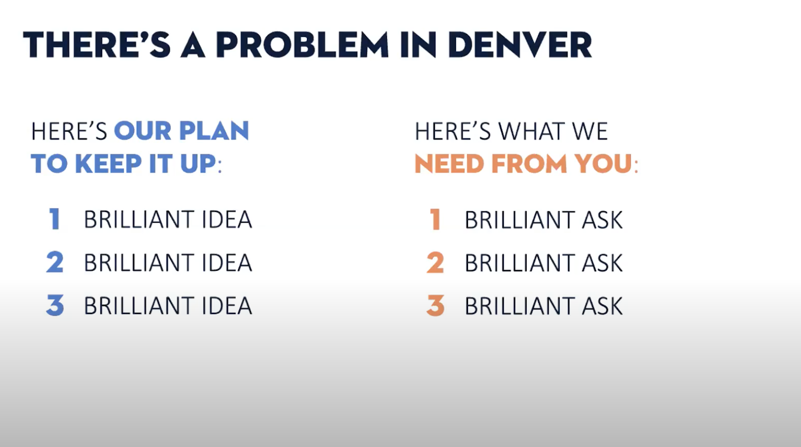
So once you’ve presented your charts, make sure to highlight your brilliant achievements on a separate slide (“damn we’re good” graphic optional). Take a moment to be proud of what you’ve accomplished and share the good news with your stakeholders:
Survey results put into context with a business case.
This chart passes the glance test.
The percentages, together with a captivating slide title that calls out Denver in a contrasting color, create a compelling chart that immediately sparks a conversation.
You can also illustrate this point in different ways. One way is to create a map in PowerPoint and overlay circles to show the different office sizes.
With a quick glance, you can see that San Francisco and Denver are approximately the same size:
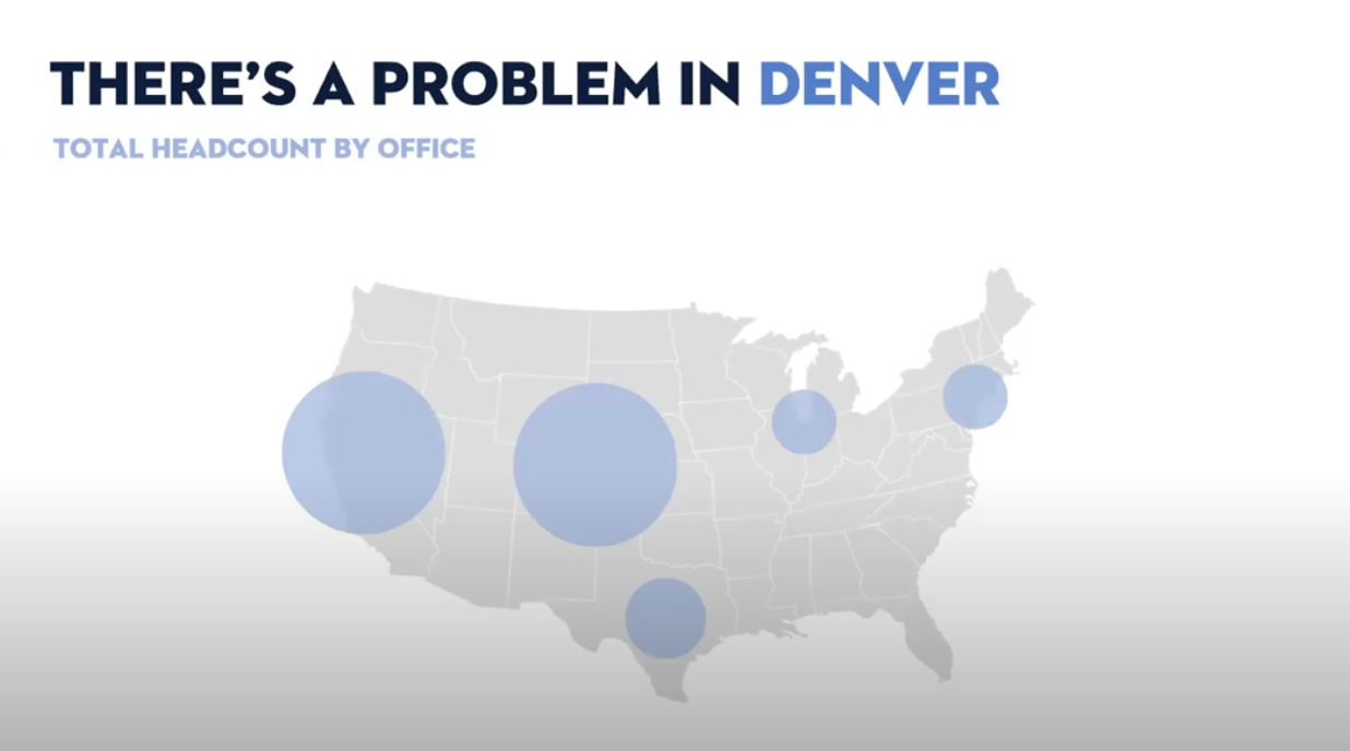
Next, overlay representative shapes to show the percentage of weekly newsletter open rates:
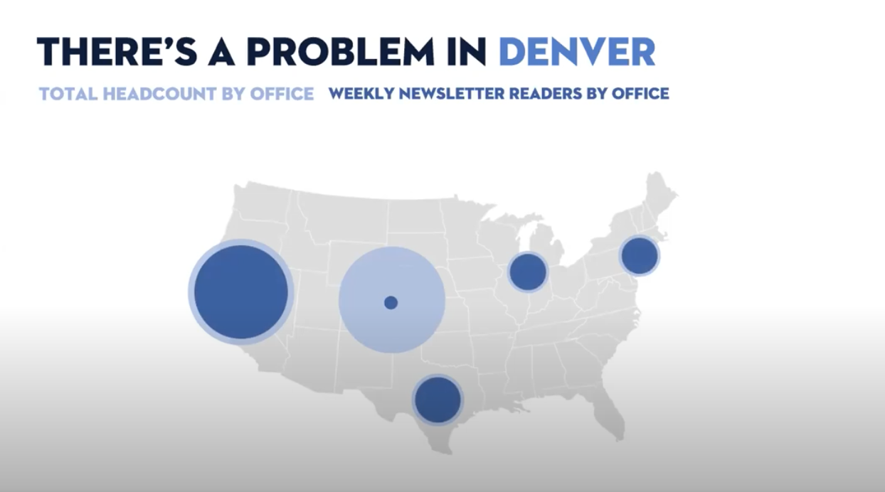
And, finally, use contrasting colors to specifically call out Denver and make your point:
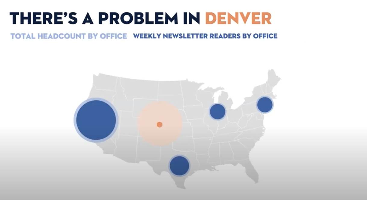
So you know that there’s a problem in Denver: no one is reading your newsletter.
But could this maybe be an indication of a larger problem?
With Staffbase, you can compare email analytics across departments, offices, or locations in your organization and compare results across the various users and senders. This way, you can find out if there really is an employee engagement issue in Denver and confirm whether your colleagues are seeing a similar pattern when they send communications to the employees located in Denver.
When you compare newsletter data with your colleagues, the point becomes clear. There really is a problem in Denver. It’s not just you and the emails you send—there is something much bigger going on.
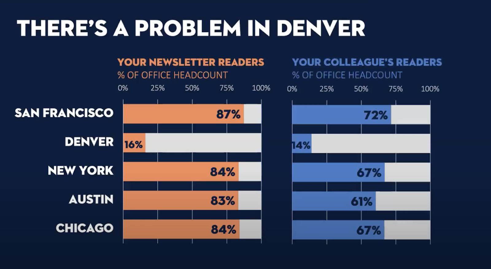
But how do you get a sense of that bigger problem?
One way is to compare the newsletter metrics with your latest employee engagement survey results, regional sales number, or any other relevant KPI that can be broken down by office or region:
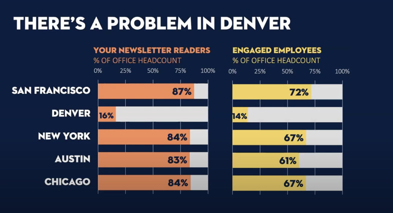
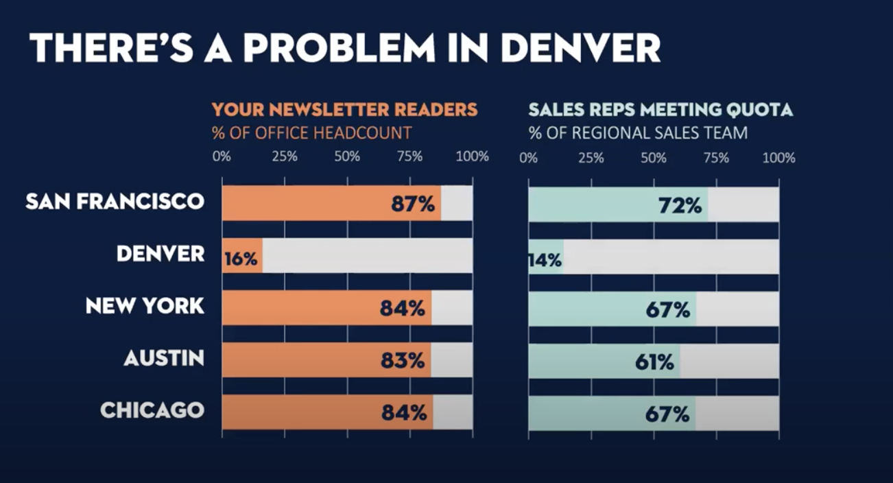
By doing this, you’ll find correlations between your internal comms metrics that strengthen the story you’re trying to tell.
And to make that story shine, take your chart game a step further: illustrate these different data sets with their own unique colors to make each comparison unique.
So now you know that it’s not just a readership issue in Denver—it’s an engagement issue in Denver.
With this context, you can then build a compelling argument for your stakeholders. Whether it’s more investment in internal comms tools or boosting budget to focus on strengthening employee engagement, you have the data to back your story up.
What data visualization tools should I be using?
Here are a few tools—via our friends at Brilliant Ink—to get you started:
Data visualization is your new best friend
By now we hope we’ve shown that data storytelling doesn’t have to be intimidating.
It can actually be easy.
Because, as a communicator, you’re already a powerful storyteller.
You are already equipped with the communications chops to present data in a relatable and convincing way—and win over your stakeholders.
Facts and figures are the what. But you provide the why.
Now, you’re well on your way to becoming a data storytelling master.
Not only is this a communications superpower, but it’s also a skill that will make you stand out in your career in the long term.
And that’s well worth the effort.


