Season 1
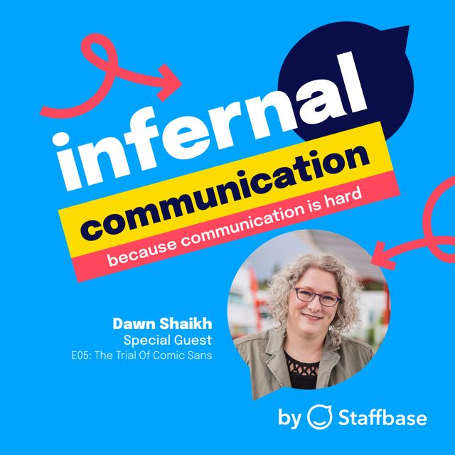
Ep 5: The Trial of Comic Sans
The font everyone loves to hate
Or listen on:Description
WARNING: This episode contains swearing and adult language. Listener discretion is advised.
How can one font elicit such strong emotions for so many people? Is Comic Sans the villain we've all made it out to be?
Listen in as Comic Sans stands trial for crimes against typeface, obstruction of font protocol and indecent exposure on documents both printed and digital.
While the kangaroo court is in session, host Kyla Sims will hear convincing testimony from graphic designer Craig Rozynski, the creator of Comic Neue and Dr. Dawn Shaikh, former User Experience Director at Google and part of the team that started Google Fonts.
Craig shares his journey in redesigning the controversial font while Dr. Shaikh cracks open her doctoral thesis on the Personality of Cleartype Fonts to help us understand what this notorious font’s history and connotations say about the biases that shape our communication norms.
Transcript
Kyla Sims: Hi everyone. I just want to let you know that the language in this episode might get a bit colorful. There are a couple of curse words scattered throughout, so if you have kids around, you might want to save this episode for later. We promise it's not meant to be distasteful. So without further ado, let's get to the show.
Crowd: I think he's guilty. Do think that…
Speaker 3: All rise. Department One of the Superior Court of Font Crimes is now in session. Judge Times New Roman presiding.
Crowd: Whispering.
Speaker 3: Please be seated.
Judge Times New Roman: Good morning Serifs and Sans Serifs. Calling the case of the people of the world ... pretty much all of them ... versus Comic Sans. Are both sides ready?
Helvetica: The prosecution is ready, your Honour.
Arial: The defense is ready, your Honour.
Judge Times New Roman: Will the Clerk Courier please swear in the jury?
Clerk Courier: Will the jury please stand and raise your ascenders? Do each of you swear that you'll fairly try the case before this court, and that you'll return a true verdict according to the evidence and the instructions of the court, so help you alphabet?
Crowd: Whispering.
Judge Times New Roman: Order, order, order. Another outburst like that, and you will be escorted out of this court. Now, District Attorney Helvetica, please address the jury.
Helvetica: Your Honour, Serifs and Sans Serifs of the court. The defendant, Comic Sans, is charged with crimes against typeface, obstruction of font protocol, and indecent exposure on documents both digital and printed. The evidence I present to you through shocking testimony today proves that the defendant is guilty as charged.
Comic Sans: Objection.
Judge Times New Roman: Comic Sans, I would advise you to communicate through your assigned counsel, Arial Regular. I'm aware you may have some bizarre tendencies, but through our procedures here-
Comic Sans: You're a bizarre tendency.
Judge Times New Roman: Proceed, Public Defender Arial.
Arial: Thank you, Judge. Under the letter laws of the land, my client is innocent until proven guilty. During this trial, you will hear no real evidence against my client. Comic Sans is innocent of the charges against them.
Kyla Sims: Welcome to the defining case of our age. It's the trial of Comic Sans.
You are listening to Infernal Communication, brought to you by Staffbase. I'm your host, Kyla Sims. Today we're cracking the lid off a can of worms that nearly everyone I've ever met seems to have a strong opinion about. This is one of those unique topics that has captured people's imaginations across professions, industries, and cultures. Of course, I'm talking about the font that everyone loves to hate, Comic Sans.
So this episode, we're putting this notorious font on the stand. We're going to get to the bottom of why this font is so infamous, and whether it deserves its terrible reputation. What we discover is going to tell us a lot about the world of design and visual communication, but also how our perceptions of something seemingly mundane as a font, may be a reflection of something much bigger than simple aesthetic preferences. So the first character witness we are going to hear from is someone who is uniquely familiar with Comic Sans. I guess you could call him Comic Sans' cool uncle.
Craig Rozynski: It's been a long time coming.
Kyla Sims: That's Craig Rozynski, a graphic designer,
Craig Rozynski: And I am the creator of Comic Neue.
Kyla Sims: Craig released this twist on the classic typeface in 2014. So how does it feel to be the father of Comic Neue?
Craig Rozynski: Well, if I'm the father, then I guess Vincent Connare is the Godfather, isn't he? He's the original creator. The reason I created it was just because I got sick of people whining about it. There was an opportunity there. Everyone hated Comic Sans. It was a punchline, and the thought occurred to me one day over 10 years ago, "Why hasn't anyone actually tried to fix it yet?" Me, being the stickler that I am, I decided to go and see if I could fix it.
Kyla Sims: So why don't you take us through how you created it?
Craig Rozynski: Sure. It was a side project. I had a full- time job, and I'd just work on it an hour here, a couple of hours there. About two years later, I was still working on it, and I finished it, and I thought, " Thank God I never have to think about it again," and I tweeted it to my ... I think I had 80 Twitter followers at the time ... and within 24 hours it was trending worldwide on Twitter, and I've been hearing about it ever since. It was a story that was running in all the major news publications around the world. There was a guy from USA Today-
USA Today: The internet has spoken. Comic Sans is the most hated font out there.
Craig Rozynski: He was walking down Miami Beach holding up Comic Sans in one hand and Comic Neue in the other, and asking people which they thought was best.
Kyla Sims: Oh my gosh.
USA Today: ... or the original? You like the original?
Crowd: Right.
USA Today: What do you like about it?
Crowd: It jumps out at you. It's easy to read.
Craig Rozynski: It just took off
Kyla Sims: And here we are today.
Craig Rozynski: Here we are.
Kyla Sims: Just really dragging it over the coals.
Craig Rozynski: Making podcasts about it.
Kyla Sims: Exactly. So I'm curious, what is the nicest comment that you've gotten from somebody for making Comic Neue?
Craig Rozynski: The comment that amuses me most is Vincent Connare's later comment.
So originally he made a nice comment about it. I think he originally said, "Oh, it should be more casual," and then Tobias Frere- Jones, who is a very famous type designer ... he designed fonts like Gotham, which is on pretty much every movie poster you've ever seen ... he said something along the lines of, "I admire Rozynski's efforts for trying to fix this font," and then Vincent replied on Twitter, "It's shite."
Kyla Sims: Oh no.
Craig Rozynski: First thing I did was put that up as a testimonial on the Comic Neue website. But again, as a designer, if I went back and looked at anything I created 10, 20 years ago, I would be probably be very ashamed, and he has the unfortunate distinction of the work he did 30 years ago is still being banded about, so poor Vincent.
Kyla Sims: Poor Vincent. So let me get it straight. You were inspired to create Comic Neue, because you were tired of hearing people complain about Comic Sans?
Craig Rozynski: Yeah. It's just part of pop culture, isn't it? And people ... it's the font that people love to hate. There's a movement run by a couple in the States about ban Comic Sans, and a favorite of mine is a photocopy on a conference room door in a big corporation, that says “Please keep the door closed. Thank you," and it's printed in Comic Sans and there's another printout underneath in Helvetica that says, "Do not use Comic Sans. We are a Fortune 500 company." So it is just a great joke, and I do feel for the original creator, who never intended it to be what it is today, but that's how it turned out.
Kyla Sims: And how does it actually, for listeners, how is it actually different than Comic Sans?
Craig Rozynski: The font was there, I just needed to see ... some things are clearly wrong ... the S looks squashed. So I went through and basically I cleaned that up. I turned it into something much bigger. Rather than just fixing Comic Sans Regular and Comic Sans Bold, I turned it into two different kinds of fonts with six different weights to each one, and I just got a bit carried away, I think.
Kyla Sims: Where do you fall on the debate of loving or hating it?
Craig Rozynski: Yeah, I have always said that Comic Sans works really well at very small point sizes ... 3. 4 point looks fantastic, but I probably wouldn't use it. The people that do tend to use it ... teachers love it, and why do teachers love it? It's a casual font. I don't know if anyone's ever used Comic Sans to try and teach algebra before, but anything that might look like hard work, they want it to look as approachable and friendly as possible. That's what a casual font is. It looks like it's been drawn by hand, so it's popular, and it's really big, and it's loved because it's there. It's just the availability of it has given its rise to popularity, I think.
But definitely among anyone that thinks they have a little bit of an eye for design, and they're partially informed by popular culture as well that, "Never use Comic Sans, don't use it. You're not allowed to use Comic Sans." The perception, the branding of this font, has a lot to do with why people don't use it, but for everyone that doesn't really care and they just need to whack a sign on a door telling someone not to do something, or create something for the kids in their class, it serves its purpose, which is fine. I think you would be really hard- pressed to find a designer that would say, " I love it and I'm going to use it." They're probably out there. I would love to find that person, but ... yeah.
Kyla Sims: Well, if you ever find them, let us know. We'll have to-
Craig Rozynski: I will.
Kyla Sims: ... get them on.
Craig Rozynski: Let's interview them.
Kyla Sims: Be like, "What is it like being the only person in the world who likes Comic Sans?"
Craig Rozynski: Yeah, yeah. But one of the questions that really interests me about this subject is, take away all of the perception of it. Why is it visually bad? Why would people say that it's poorer than, say, a well- constructed font, like Helvetica? And that question really interests me, because we hear beauty in the eye of the beholder. We hear things like the golden ratio, and the rule of thirds, and these rules or guides around what makes something look good ... is that universal or is that something that we've learned?
Kyla Sims: It's interesting, just diving into that sort of perceptual that connotations or previous associations with things. We talked about ... actually in our first episode, we talked a lot about how people perceive something, and how it changes, whether we believe it's useful or good.
And so it's interesting, that font choice is one that people get ... especially designers, obviously ... get very passionate about. And so I'd love to hear your thoughts on how our perceptions of a font can influence the way that we interact with things.
Craig Rozynski: Yeah, definitely. We're built for story, right? Basically, since we're born, our parents start telling us stories. We love stories. Anything that has a story attached to it is instantly going to be more memorable than something that doesn't.
Comic Sans has perhaps one of the most varied stories to it, and that definitely helps explain why it's so popular.
Kyla Sims: If you were to describe Comic Sans as a person, what would you picture them as?
Craig Rozynski: Daffy Duck. Is that a person? That's an animal. Yeah, yeah.
Kyla Sims: You are listening to Infernal Communication, a podcast brought to you by Staffbase, where we dive into the deeper conversations happening behind some of the biggest comms problems and puzzles that impact organizations and beyond. If you are enjoying the show so far, make sure you follow us on Apple Podcasts or wherever you like to listen. If you like the show and you want me to keep my job, please leave us a review, and let us know what you think. You can also check out the show on our website by going to infernalcommunication.com.
Judge Times New Roman: The prosecution may call the first witness. Helvetica Normal, who do you call?
Helvetica: The people call Miss Judy Pritchard to the stand. Do you need some water, miss?
Miss Judy Pritchard: No, no. Thank you, Helvetica.
Helvetica: Please, may you address the court with what happened to you and take your time.
Miss Judy Pritchard: Yep, I will try. It was supposed to be the setup for the perfect day. My fiance and I were preparing for our wedding, sending out invitations, you see. We were in a rush, so we typed them out. You all know how wedding planning can get, but despite that, we personalized each invitation with the weight and depth of the love that we felt for each other on every page. It would be the event of the year, the envy of all of our friends and acquaintances, but most importantly, it would have class and timelessness. So when we went to have them printed, it was clear the curving delicate elegance of Darleston, using sentence case was the only sensible choice. But then, then-
Helvetica: Take your time.
Miss Judy Pritchard: It's okay, pookie. Well, when we got the invitations back, it was outrageous, horrible cruelty. Every letter, every syllable, every sentence was infested with Comic Sans.
Crowd: Whispering.
Miss Judy Pritchard: With a font like that, everyone must have thought it was some sort of joke. Nobody came to the wedding, no one came.
Arial: And how many invitations was it, ma'am?
Miss Judy Pritchard: I don't know. Hundreds.
Helvetica: Objection.
Arial: Is it possible that no one came to your wedding because no invitations were sent in the first place?
Helvetica: Objection. Objection. My witness does not have to answer that.
Miss Judy Pritchard: How could I? They were horrible.
Judge Times New Roman: Objection sustained. Sit down at once, Arial.
Crowd: I didn't get one. Did you get one?
Arial: No further questions, your Honour.
Kyla Sims: In this episode, we are evaluating the evidence against the font that everyone loves to hate, Comic Sans, but we're also looking past the punchline, to see why it elicits such strong feelings from designers and dilettantes alike.
What is it about this goofy Sans Serif that keeps people talking about it, and what does this all say about the biases that shape our communication norms? While speaking with Craig, we discussed how each typeface has a sort of personality, which takes us to our next witness in this interrogation. Now and why do people assign attributes to something as inert as fonts?
Dr. Dawn Shaikh: Yeah, I got it out just in case. So big.
Kyla Sims: So I decided to ask the person who you could say literally wrote the book on this very thing.
Dr. Dawn Shaikh: There she is.
Kyla Sims: It's bigger than your head. Can you, with your book now, can you describe to our audience what this book that you've written looks like?
Dr. Dawn Shaikh: Well, it's a very large book of 624 pages of everything you ever want to know about the perception of the personality of type. Yeah, it's very large, black binding, got my name on the spine, and the year 2007.
Kyla Sims: Dr. Dawn Shaikh is a psychologist, former user experience director at Google, and one of the founders of Google Fonts.
So I need to right off the bat, throw it to you, how do you feel about Comic Sans?
Dr. Dawn Shaikh: I don't hate Comic Sans. I'm not a fan girl, but I don't hate it.
Kyla Sims: Have you ever seen it in any particularly egregious places?
Dr. Dawn Shaikh: When it's used for warning signs or resumes? Yeah, there are some bad uses of Comic Sans, and that's what I don't love about it, is people don't use it correctly.
Kyla Sims: What was the intended purpose of Comic Sans?
Dr. Dawn Shaikh: My understanding is that it was designed to be used as the help bubbles or the speech bubbles for a character that was supposed to be teaching children more about computers, to be used in text that was intended for children in a learning environment, in a fun learning environment. That would make sense.
Kyla Sims: So let's go back to that massive book of yours. Your thesis is quite the volume. Can you take us through your journey in creating this thesis, and what prompted you to so meticulously research fonts?
Dr. Dawn Shaikh: When I started as a graduate student at Wichita State University, one of the opportunities that was presented to me was to work with Kevin Larson at Microsoft, on the legibility, readability of the clear type fonts which were being developed in that era. This was the era when you would have to buy fonts on CDs, and I had over 2, 000 fonts installed on my computer. So I just ... typography is the base of so many of our experiences, and it makes such a difference when things are readable, legible, appropriate, fun when they're supposed to be fun, and I do think typefaces matter.
So I proposed and worked with Dr. Chaparro to come up with this idea of doing a modern day evaluation regarding the personality of typefaces, and do people associate personality with a typeface when they see it on a screen? So there had been a lot of research done, billboards, advertising, newspapers, things that were print, but actually looking at personality of typefaces on screen, at a time when we were moving more to onscreen reading and onscreen consumption of information, seemed like an interesting journey. And it just evolved from there, to where we ended up doing three big efforts around, do people associate personality type faces? They do. Do people feel that there is an appropriate typeface for a given document type? They do. And then if you violate those two things, like you use an inappropriate typeface for a document, what happens to the perception of the author of that document?
Kyla Sims: And this was in 2007-
Dr. Dawn Shaikh: Right.
Kyla Sims: ... that you did your thesis, which is kind of the perfect time, because that was sort of the rise of Facebook. Everybody was starting on the social media stuff.
Dr. Dawn Shaikh: And MySpace was still around.
Kyla Sims: Yeah, I remember. I had a MySpace. I'd love for you to take us through some of these font personalities. What did people associate with a font like Times New Roman, all the way to, let's say, a font like Papyrus?
Dr. Dawn Shaikh: I did, I didn't-
Kyla Sims: Oh, you're cracking open the book. I love it.
Dr. Dawn Shaikh: I'm cracking open the book. Yeah, so I created these really beautiful charts that took days of work in Excel. Basically, I was asking folks to rate the typefaces on semantic differential scales, so things like quiet/ loud, sad/ happy, and so then I could create these beautiful charts.
And you asked about Times New Roman. I'm turning to my page with Times New Roman here. Was seen as ... no, he was not the most masculine. Sorry, that was Courier New was the most masculine. So Times New Roman is a Serif font, and he was kind of middle of the road on everything.
The most opinionated of these Serifs is Courier New. Let's see, Papyrus ... let's get over there to ... Papyrus is a display font, slightly feminine, slightly soft, delicate, relaxed, beautiful. Middle of the road, sad/ happy, middle of the road, weak/ strong. A little more warm, a little more old, and more legible. It was in 2007, the most expensive, if you look at expensive versus cheap.
Kyla Sims: Really?
Dr. Dawn Shaikh: Yes.
Kyla Sims: Honestly, that makes total sense. From the number of restaurants I saw with-
Dr. Dawn Shaikh: Yes.
Kyla Sims:: ... Papyrus title cards.
Dr. Dawn Shaikh: Avatar had not come out yet.
Kyla Sims: And I think Ryan Gosling would agree with you.
Dr. Dawn Shaikh: I think so, yes.
Kyla Sims: For our listeners who are not familiar, there's a skit that SNL did about the movie Avatar.
SNL: Avatar, the giant international blockbuster, use the Papyrus font as its logo.
Kyla Sims: And can you confirm this, Dawn? That is actually Papyrus font?
Dr. Dawn Shaikh: I think it is. I think it is. I didn't work with the team or anything, but it does look like Papyrus.
Kyla Sims: It looks it.
SNL: I think this is literally papyrus. Maybe that was a starting point, but they clearly modified this, But whatever they did, it wasn't enough.
Dr. Dawn Shaikh: Because typeface matters, right?
Kyla Sims: Absolutely. Let's go back to your research again, and talk about how a font might be perceived as masculine or feminine, or cheap or expensive. How were you able to discern that in the research?
Dr. Dawn Shaikh: I studied 40 typefaces, and at the time I was choosing typefaces that were commonly present on people's computers. What I saw on the research was that it really fell down to the type of typeface or the type of font that you were looking at. So there's Serif, Sans Serif, Display, and these different classes really ... or the script and handwriting typefaces ... those classes, that's really where it broke down. So by and large, script and handwriting were more feminine, versus your Sans Serif and Serif, which were more on the masculine side.
So really the results clustered around standard, accepted way of classifying typefaces into one of their bigger groups. I will say, before our meeting, I was like, "Oh, I'll just skim over some of my stuff in my dissertation," and I didn't remember that I asked in my study one, if folks had a favorite or least favorite font, and the most commonly cited least favorite was Comic Sans.
Kyla Sims: It doesn't surprise me.
Dr. Dawn Shaikh: It was like 25% of people willingly wrote down in a freeform text field, " Comic Sans." I actually didn't include it in my research because I just felt it was so polarizing.
Kyla Sims: That's so funny.
Dr. Dawn Shaikh: And I did include Papyrus, where if I was doing it today, I might feel that Papyrus is so polarizing, so-
Kyla Sims: How did you make sure people's perceptions of the fonts were associated with the fonts or the typefaces themselves, and not the words that were written in that font?
Dr. Dawn Shaikh: Yeah, so this was an interesting rabbit hole that I went down. It's hard for a reader to disassociate. If I read "infernal communication", I have my own connotations of those words, aside from the typefaces. So I actually spent a lot of time researching what might be an approximation to English, because I was only running with native English speakers, but I ended up using what's called an N- gram generator. Based on other theories of communication, I decided to use what's called a trigram, and basically if you take a word like infernal, I- N- F is a trigram, N- F- E, F- E- R, so all of those little trigrams. And then I used an expert in the field of typography to rank my trigrams by how commonly they appear in English, and so all of my simuli was devoid of context, because it was written using trigrams.
So I tried to separate potential meaning of the text, so that I could only focus on the personality of the typeface.
Kyla Sims: That's very smart. So our audience is mostly communication professionals, who are used to choosing fonts for various design purposes, like newsletters and bulletins and intranets and all that sort of stuff, and sometimes they even have to push back on various font usage inside organizations, to make sure that the brand is cultivating the right perceptions, both internally and externally. So most people play it pretty safe. They stick to the basics. We got our Arial, we got our Times New Roman, et cetera, but if communicators want to play a bit more with fonts, what kind of things should they look for when choosing a font for professional communication, or in asset design for a campaign?
Dr. Dawn Shaikh: I still think you have to first pick something that's highly legible, and legibility goes a long way. If someone can't read your words and your message, it's kind of pointless in creating it. But also just, I do think you need to think about the personality that you want to convey, or the attributes that you want to convey in your message. I would not want to see a political ad with Comic Sans or Papyrus, so I definitely think aligning something about the attributes, like how a font ... and it doesn't have to be scientifically proven to be masculine, or to be strong, or to be feminine ... but just thinking through, "How does it make you feel when you see that font?" And maybe asking a few of your friends, just in case you do like Comic Sans, or do a little research on your target audience. But definitely something that's appropriate for the message, and that was one of the big parts of my study three was, if you don't align that perception of the personality with its intended use, then your credibility as an author or a distributor of the information is really decreased, so you just want to make a good choice.
Kyla Sims: We're putting Comic Sans on trial for font crimes in this episode. So if you were on the jury, what would be your verdict? Guilty or not guilty?
Dr. Dawn Shaikh: Is it guilty of crime?
Kyla Sims: Font crimes.
Dr. Dawn Shaikh: I don't think Comic Sans did anything. I think humanity did something to Comic Sans, so I would let Comic Sans have a pass if I was judging.
Kyla Sims: We'll take that into account, Dawn.
Dr. Dawn Shaikh: Yes, yes.
Kyla Sims: Oh my goodness.
Helvetica: And can you explain what happened then, Wingdings?
Wingdings: Noises.
Helvetica: A chilling story, indeed. I have no further questions.
Judge Times New Roman: Defense, the witness is yours for cross- examination.
Arial: No, your Honour, let's just move on to the next witness.
Judge Times New Roman: Very well. Who do you call?
Arial: The defense calls the defendant themselves. We call Comic Sans to the stand, your Honour.
Judge Times New Roman: Let the record state the defendant is taking the stand to read a prepared statement. Go ahead, Comic Sans.
Comic Sans: I've had enough. It seems that this court has made up its mind about me before this sham of a trial began. Well listen up.
Kyla Sims: And now to read the defiant last statement of Comic Sans, Mike Lacher, writer of, "I'm Comic Sans, Asshole."
Mike Lacher: Listen up, I know the shit you've been saying behind my back. You think I'm stupid, you think I'm immature, you think I'm a malformed, pathetic excuse for a font.
Comic Sans: Well think again, nerdhole, because I'm Comic Sans.
Mike Lacher: Because I'm the best thing to happen to typography since Johannes fucking Guttenberg. People love me. Why? Because I'm fun. I'm the life of the party, I bring levity to any situation.
Need to soften the below of a harsh message about restroom etiquette? Slam. There I am. Need to spice up the directions to your graduation party? Wham. There again. Need to convey your fun- loving, approachable nature on your business's website? Smack. Like daffodils in mother- fucking spring.
Comic Sans: You know why, jagoff ? Because I'm famous. I'm on every major operating system, since Microsoft fucking Bob. I'm in your signs .
Mike Lacher: I'm in your browsers, I'm in your Instant Messengers. I'm not just a font. I'm a force of mother- fucking nature, and I will not rest until every uptight armchair typographer cockhat like you, is surrounded by my lovable comic book inspired Sans Serif badassery. Enough of this bullshit.
Comic Sans: I'm going to go get hammered with Papyrus.
Crowd: Guilty .
Comic Sans: Yes, yes. Tell me how much you hate me. It doesn't change anything-
Judge Times New Roman: Order.
Comic Sans: ... does it?
Kyla Sims: Well, dear listener, it doesn't look like we've gotten to the bottom of this, so why not tell us what you think. Is Comic Sans the villain we've made him out to be? Or is he just misunderstood and misused? You be the judge. Go ahead and tweet us at Staffbase, and tell us your verdict, so we can finally put this case to rest.
All jokes aside, I think there's a lot to learn from this conversation, not only about font choice, but about design and all of the little things that play into how communication is perceived and received. Turns out font choice matters. The medium after all is the message. Just like the clothes we wear or the outfits we choose, fonts can say a lot about us. They imbue stylistic quality to the communications we send, and hopefully sharpen our impact.
Choosing between the stately Times New Roman, austere Helvetica, or the delicate Courier, is like choosing between a sports coat, a sweater, or a black hoodie. They're all versatile, all classic, but really do say something about you, depending on the occasion you're dressing for, and sometimes certain fonts are akin to dressing up in spandex and a cape.
Comic Sans: And I am a Sans Serif superman, and my only kryptonite is pretentious buzzkills, like you.
Kyla Sims: I'm Kyla Sims, and this has been the trial of Comic Sans. Today, our guests were Dr. Dawn Shaikh, psychologist and former user experience director at Google, and graphic designer and creator of Comic Neue, Craig Rozynski, as well as copywriter and creative director, Mike Lacher. Our next episode is going to be dropping right before the New Year, which is traditionally a time of reflection, but sometimes that reflection can bring up some pretty challenging feelings, so we're going to be talking about that in our next episode, ‘How do you really feel’?
Tangia Renee: Like, I went to a bunch of doctors and nobody could help me. They were basically telling me it was all in my head, and I was like, "Okay."
Kyla Sims: It's not helpful.
Tangia Renee: The hives are not in my head.
Kyla Sims: Look.
Tangia Renee: Other people can see them.
Kyla Sims: That was just in my head. Don't forget to hit follow on Apple Podcasts or wherever you get your shows, and if you like today's episode, leave us a review. We would love to know what you think. Until then, thanks for listening.