Your Guide to Creating Internal Newsletters Employees Will Love
Email isn’t going anywhere.
Email newsletters are organizations’ most inclusive point of contact for all employees — from front-line workers to remote workers and leadership.
But despite email’s staying power, there are a lot of ways that email newsletters can fail.
From bad color schemes and content, to designs that don’t work on all devices and inaccessible language, there are a lot of potential pitfalls when it comes to creating a newsletter that works for you and your employees.
Download our 5 Beautiful Employee Newsletter Templates for Outlook
We really love newsletters. We have seen newsletters work without fancy designers or ground-breaking stories. If you can leverage what you’ve got and play to your strengths, you can transform your newsletter and reinvigorate the channel.
That’s why we have put together this handy guide so you can assess, create, and relaunch your newsletter. With a little bit of guidance, you’ll have employees clicking and engaging in no time.
Table of Contents
1. The state of employee newsletters
2. How to relaunch your internal newsletter
Step 2 – How to create great internal content for your newsletter
Step 3 – How to write your newsletter to get employees reading
3. Ten employee newsletter templates
The state of employee newsletters
In our webinar on employee newsletter design principles, experts Shel Holtz, Rita Zonius, Sean Williams, and Angela Sinickas talked about how they see a lot of practitioners ready to throw the baby out with the bathwater when it comes to older comms platforms — like email.
Practitioners often look to jump on the next new platform before optimizing the channels they already have.
If you’re frustrated with your email channel, you don’t have to dismiss it all together to get the results you’re looking for.
You may not have the right tools to measure and increase engagement, or haven’t found any newsletters that inspire you yet.
To dig deeper into the state of employee newsletters, we asked the following questions to the 125 guests of our webinar on this topic:
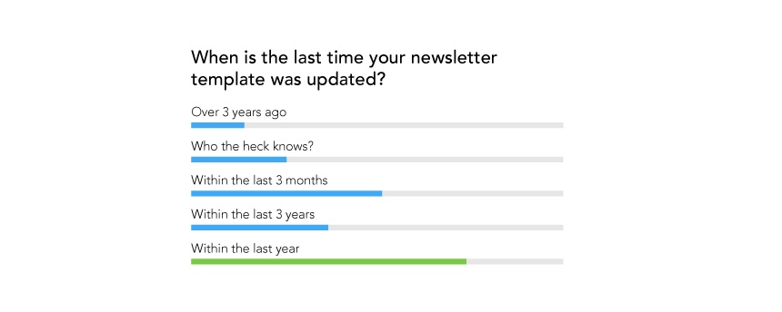
1. When was the last time your newsletter template was updated?
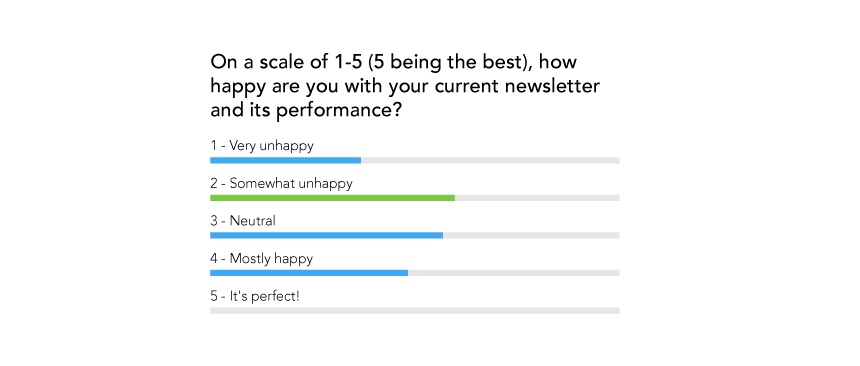
2. On a scale of 1-5 (5 being the best), how happy are you with your current newsletter and its performance?
3. Does your newsletter look good on all devices or browsers?

4. How would you rate engagement with your newsletters (1-5 scale, 5 is the best)?
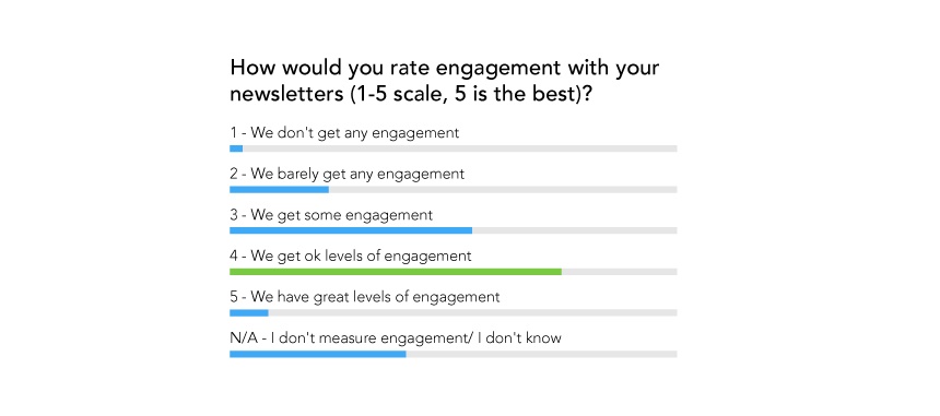
Though our sample was self-selected from a group of people who were clearly interested in improving their newsletter (we assume that’s why they joined the webinar), we still were able to see some interesting correlations in our data:
1. People who hadn’t updated their newsletter in over 3 years, reported “ok” levels of engagement.
Key Takeaway: Communicators seem to be living by the adage: if it ain’t broke, don’t fix it.
2. Second, most people who didn’t know when their newsletter was last updated didn’t have a mobile-friendly newsletter, were very unhappy, and were not measuring engagement.
Key Takeaway: Newsletter creation, design, and engagement is stressful when you don’t have the right tools or resources to change your template or measure your success.
3. We also found that most people who had updated their newsletter in the last year didn’t have a mobile-friendly newsletter.
Key Takeaway: Organizations are not giving their comms teams the tools or resources they need to connect with their non-desk workforce.
4. We know that it is very difficult to design an engaging mobile-friendly newsletter without dedicated email tools. Most of the people we surveyed who said they were very unhappy with their newsletter also reported that it wasn’t mobile-friendly.
Key Takeaway: Lack of a mobile-friendly newsletter is hurting engagement and newsletter performance.
5. And most people who said they were very unhappy didn’t measure their engagement.
Key Takeaway: Communicators who can’t tell in which ways they’re succeeding nor have the benchmarks they need to measure improvement aren’t happy with their internal newsletters.
6. Most people who said they were very unhappy with their newsletters didn’t know the last time it was updated — or it happened more than three years ago.
Key Takeaway: Out-of-date newsletter templates and a lack of tools are hurting newsletter performance.
7. Most people who said they were happy had a mobile-friendly newsletter.
Key Takeaway: Mobile-friendly newsletters are crucial; communicators that have better tools to create their newsletters see better performance.
As you can see, the results were very telling. Even the best newsletters need to stay updated and it seems like most people don’t know where to start.
How to relaunch your internal newsletter
You’ve updated your internal newsletter within the last year, and you thought you had a great new design that employees would love. But it turns out that the new newsletter’s performance is less than you’d hoped it would be.
What went wrong?
Well, first of all, relaunching your newsletter to employees is no easy feat.
But secondly — and most importantly — to really move the needle on your results you have to look at your newsletter holistically and update it accordingly. Addressing just one element (like design, content, copy, voice, or measurement) isn’t a viable solution.
Rather than suggesting minor tweaks, let’s take a look at this relaunch from the perspective of a complete newsletter makeover.
We’re going to take you through five key steps and considerations for re-launching your newsletter and help you create something employees love to read.
We’ll look at:
Design
Content
Voice and writing
Calls to action
Measurement
Step 1 – How to choose the right newsletter template
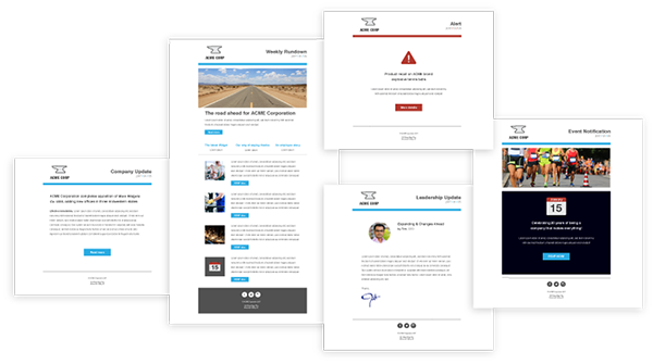
The first step to an awesome internal newsletter is choosing a user-friendly design that plays to your team’s strengths, looks good, and is enticing to read.
Newsletter design basics
When we talk about design here, we’re talking about how the layout, formatting, fonts, and images combine to impact how your newsletter is read and received.
First, you need to pick a layout. The most important thing to consider when choosing a newsletter layout is the strengths of your team.
Don’t have a graphic designer? Are you a strong copywriter? Then text-heavy may be right for you.
Do you work for an organization that naturally produces fun, interesting images? Then an image-heavy newsletter might work better.
Likewise, a long-form newsletter might suit your organization better if access to your intranet is limited (so putting full stories in the newsletter itself makes sense). While a short-form newsletter will generate more clicks through to your intranet and can help you gather more engagement data.
Download our resource on employee newsletter best practices
Reducing cognitive load in your newsletter
Now that you have your overall structure, you need to think about how your style and formatting impacts cognitive load.
What is cognitive load? Cognitive load refers to how difficult your comms are to process visually and mentally.
And if your newsletter is difficult to read, then, well . . . no one will read it.
Newsletters typically contain tons of diverse content and calls to action, so there can be a lot of competing content that makes things cluttered and confusing. Your aim should be to design your newsletter so that the content is clear, easy to read, and digestible.
So how do you do that?
A general rule is to not overload any aspect of your newsletter. You want to make it skimmable and snackable.
Use white space to give content room to breathe, and add headings and subheadings to make it clear what each section is about.
You should also limit the number of fonts and colors used (and keep them on-brand).
It’s also good to make your design cohesive with other comms because it creates a more seamless experience, allowing employees to recognize what they’re receiving without any extra effort. It also looks much more professional.
The right images can add interest, personality, and engage readers, but bad images will make it seem like you don’t care. Generic-looking business people smiling and giving thumbs up doesn’t mean anything to anyone.
Just say no to corporate stock photography.
Designing your internal newsletter for mobile devices

Designing for mobile or various screen sizes is often referred to as responsive email design.
Responsive email design means that an email will respond to the device it’s viewed on, rather than just showing a smaller version of the desktop email. Responsive design usually includes elements like columns that stack on top of each other in the email, and fonts and images that automatically resize to fit the screen.
Our webinar poll indicated that 60% of respondents did not have a mobile-friendly newsletter.
This is a big deal.
You need to consider how your newsletter will be consumed by non-desk or remote workers. If they can’t read it, you’re depriving them of one of your key comms channels.
Using an internal comms platform like Staffbase can give you email design tools that create responsive employee emails automatically.
If you’re not using a tool like ours, there are still important steps you can take to create more mobile-friendly designs.
For example:
Simplify your layout.
Ensure anything that’s clickable is large enough to touch with your finger on a mobile device.
Consider your image sizes. If people are receiving on mobile, you don’t want super high-resolution images that will take ages to download and use up all their mobile data.
Now that you’ve chosen your design, you need to say something.
Step 2 – How to create great internal content for your newsletter
How your design comes together will depend a lot on what content you have in your newsletter. But trying to figure out what kind of content employees want to read and balancing that with what you have to communicate isn’t always straightforward.
If you want employees to read your content, you have to show how the content is relevant to them or their work.
When you measure which links your audience is clicking or not clicking, it’s easy to discover which content is most relevant. If you have a feature that has less engagement, try representing the content in a different format or change its placement in the newsletter.
But remember: no one is going to read everything you write every time. No matter how much time or effort you put into your content — or how relevant it may be — employees are bound to miss the odd newsletter.
As you create content for your next newsletter, make sure you look at why certain pieces of content didn’t perform in past newsletters. Ask yourself:
Is it hard to read?
Is it clear what it’s about?
Is it relevant?
Was the message sent while employees were on holiday?
Does it get skimmed because it doesn’t stand out visually?
Is there a content type that would make this information more engaging?
No one likes to have their time wasted. Respect your reader and keep the most important information at the top of your newsletter and easily accessible. User attention drops off significantly after the fold (the bottom of what is visible on a screen without scrolling), so make sure your most important info is front and center.
And of course, get to the point. Your newsletter is not the place to show off how much you can write or all the big words you know. The fewer words you use, the more impactful your message will be, and the more likely people will be able to read and understand it.
And finally, make sure you spice things up with different media and content types.
Step 3 – How to write your newsletter to get employees reading

Your company’s voice and tone will affect how you write your content and how you address employees. Your voice and tone play a huge role in how engaging your content is.
You can have an incredible, hard-hitting, super-important communication for employees, but if it’s written poorly or robotically, employees will check out at best — and, at worst, misunderstand it.
Your company may already have documents outlining its public voice, so it’s worth checking those out to make sure your branding is consistent inside and out of your organization.
Finding your voice
If your company does not have a voice and tone document already, it is important to develop your own. A written voice and tone guide establishes a personality that helps people get familiar with your writing style and what they can expect from you.
It will also help anyone who wants to contribute to the newsletter to write better content, which can make editing their contributions so much easier.
The best way to start is to decide what your voice is and what it is not. For example, in the Staffbase voice and tone doc, it says:
Staffbase’s voice is:
Friendly, not silly
Creative, not stiff/corporate
Human, not robotic
These guidelines help everyone contributing to our blog, website, or other communications tailor their writing style.
It’s also a good idea to have a list of things you do or don’t say.
For example, we try our best to stay away from:
gender stereotypes
anything that’s arrogant
anything overly-vulgar
too many jokes and puns
Next, it’s important to figure out who you are to the reader. Are you a good friend? Are you a superior? Or are you a friendly neighbor? How you relate to your reader will change what you write, how you talk to them, and how they relate to you. This will change how your content is received, so think carefully about it.
All of these steps will help you make your writing clearer, more consistent, and hopefully, make the whole writing and editing process easier.
Step 4 – How to develop calls-to-action for your newsletter

It’s important to clarify what it is exactly that you want readers to do when they read your newsletter. CTAs (or calls-to-action), aren’t just for marketers. They are a great way to measure your engagement levels and get employees to take action.
If you want employees to take a specific action, you have to tell them.
First, you have to make CTA buttons stand out. If you have multiple buttons that you want people to click in a newsletter, make sure you tell them to click and why. Make it clear what they can expect to find on the other side of the button and you’ll get a more accurate measurement of who is actually interested in that particular content.
Now if you have 30 buttons or links in your email, you’re going to have to decide what’s more important to you, that people click on a couple of specific ones, or that there is broader engagement. People aren’t going to click every single one; in fact, most people aren’t going to do more than a couple of clicks on a page before they leave (including scrolling), so make it count.
Step 5 – How to measure your newsletter’s performance

The final step to improving your newsletter is to measure its performance.
Based on our poll results, it seems that unfortunately, internal communicators don’t always have the data they need to truly understand engagement with their newsletter, or how it changes over time.
Employee email measurement is our thing at Staffbase, and we believe you should be tracking and measuring every internal email you send, but it’s particularly important in the context of relaunching your newsletter.
If you have data on how many people open and read your newsletter, you can work out its average performance and create a baseline from which to measure the success of any changes you make. Once you have that data, you can start targeting areas to improve.
Setting your baseline
To set a good baseline, you should track metrics that answer important questions about your newsletter, like how many people read it, how many people click, what they click, where they are opening the newsletter, and how they are reading the email.
Use these insights to inform your content choices and how it’s presented in your newsletter.
Metrics on device and location can be particularly useful for large, international companies that have offices in different locations and countries, or many non-desk workers. You may just find that your corporate comms aren’t resonating in every location you operate and you need to adjust your strategy.
Download our guide to measuring internal email here
Using your baseline to analyze, test, and improve
Once you have a baseline for all of these metrics, you can use this data as a benchmark to measure the success of your newsletter relaunch.
However, your relaunch should be just the beginning of your measurement. Once you have a baseline and have relaunched your newsletter, you can start analyzing, testing, and improving your newsletter on an ongoing basis.
This will involve digging deeper into your baseline figures and thinking about why your metrics are what they are. Using measurement you can diagnose your newsletter content, target areas to improve, and come up with ideas to fix it.
Other ways to analyze your newsletter
Using a platform like Staffbase, you can embed pulse surveys and reaction blocks into your emails to get direct feedback on your newsletter. These can also be used to gauge sentiment on specific elements of your newsletter.
Pulse surveys and social reaction blocks can be extremely useful for getting quick, actionable feedback on your newsletter content, while making your emails an interactive two-way comms channel.
Download our Quickstart Guide to Pulse Surveys here
10 employee newsletter templates
We know that often internal communicators can feel like they don’t have the time or expertise to design templates themselves, so we’ve created these templates to get you started and make relaunching your newsletter as easy as possible.
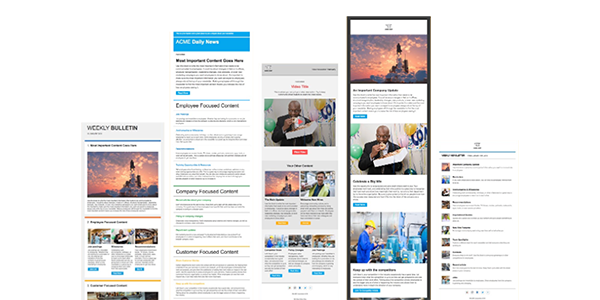
All of these newsletter templates were created in the Staffbase employee newsletter designer.
Using our simple drag-and-drop interface, it’s possible to create stylish and effective internal comms emails, even if you have no design experience.


