I am an email newsletter evangelist.
I love them.
I think they are the smartest, coolest, most accessible communication channels ever.
In fact, I’ve proclaimed my love for email newsletters to communicators around the world at our Comms Labs events, trying to show internal comms pros the potential that this channel has.
So needless to say, I’ve done my research.
But I haven’t just looked at the best employee newsletter designs. I’ve also looked at how different organizations approach newsletter content—both for internal and external audiences.
Now, I’m going to convert you into a newsletter-lovin’, hit-send-joyfully believer.
In this post, I will walk you through my favorite external and employee newsletter designs, while highlighting what’s awesome about them, and what tactics you can implement right away in your own employee newsletter.
Let’s get started.
Newsletter Examples
- The Hustle
- The Skimm
- Next Draft
- Designer News Digest
- Review by Niice
- Rooki.design
- The Art of Work
- 3-2-1 Thursdays by James Clear
- The Fenwick Papers
- Thrive Market
- Robinhood
- Resy
- Oscar Monthly
- Ueno
- Flock
- G2
- Blinkist
- Daily Dose
- Biweekly Newsletter
- Longform Employee Newsletter
- Leadership Update
- Crisis Response
- Remote Work Check-in
- Short-form Newsletter
- Love Notes by ME

Newsletter Example #1: The Hustle
This was the first email newsletter I ever looked forward to seeing in my inbox every single day. I was able to convince our marketing team to subscribe and soon we were checking in with each other every day, eager to talk about what we’d read.
Are we engaged? No way—we are full-on hooked. And over 1 million subscribers feel the same way.
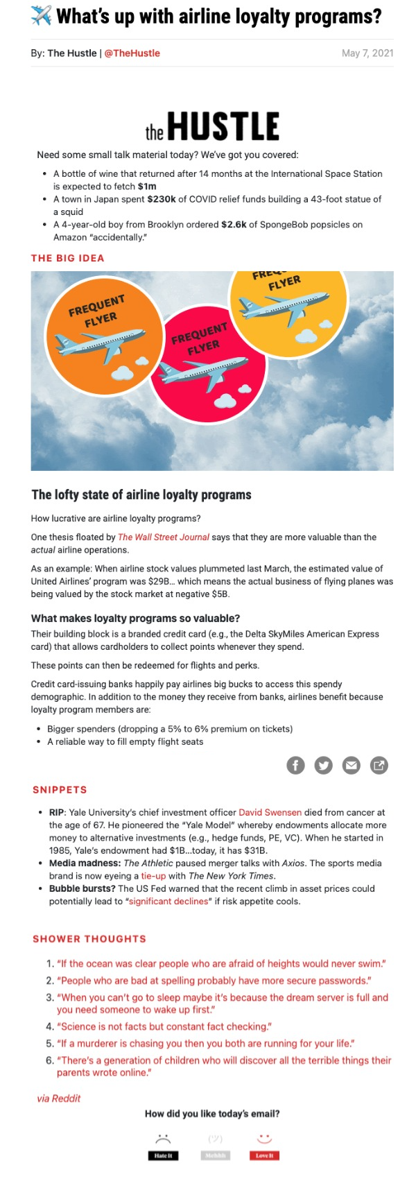
The Good:
- The Hustle is great at sourcing what is relevant to their readers and focusing on just a few of the most important stories.
- Their format is easy to read (they make great use of headings, subheadings and plain text) with lots of in-text links for continued reading and story sources.
- They have unique calls to action that make you laugh and think while you share.
- They have recurring content blocks like Friday Shower Thoughts, From Our Toolbox, and actually-fun-to-read sponsor pitches that you come to expect and always enjoy.
The Amazing:
- Their copy is unreal. They have the uncanny ability to condense complicated stories into just a couple of sentences that help you understand what the heck is going on in the world and why it matters.
- Their subject lines are the best. We love seeing them in our inboxes. They always have us chomping at the bit and wondering what in the world is waiting for us in that email.
- They’re down-to-earth. You won’t find corporate jargon or back-patting here. They are obvious and transparent when they are advertising, and they are always trying to improve their methods and content.
The Takeaway for Employee Newsletters:
- Your copy matters. Making people laugh and think is the best way to get them engaged and hungry for your next newsletter.
- Narrow down your content. Make the newsletter snackable. Pick just a couple of topics and ideas and explain them clearly and concisely. And use in-text links so people can do their own research if they want to learn more.
- Text is back. Besides the header image, which honestly, we rarely even look at, the Hustle has no images and is still the most engaging email in our inboxes.
- Balance consistency with creativity. Keep the formatting consistent so people know what content can be found where, but also try different features and see how they perform.
- Use headings and subheadings liberally–they help break up the design make the content more scannable.
Newsletter Example #2: The Skimm
The Skimm, though controversial, boasts an open rate of over 40% (which is super high for an external email dontcha-know).
With over 6 million subscribers, they have over 1 million people opening their newsletter, including a bunch of high-profile celebs like Oprah, Sarah Jessica Parker, Trevor Noah, Shonda Rhimes, and Chelsea Handler.
They’re clearly doing something right.
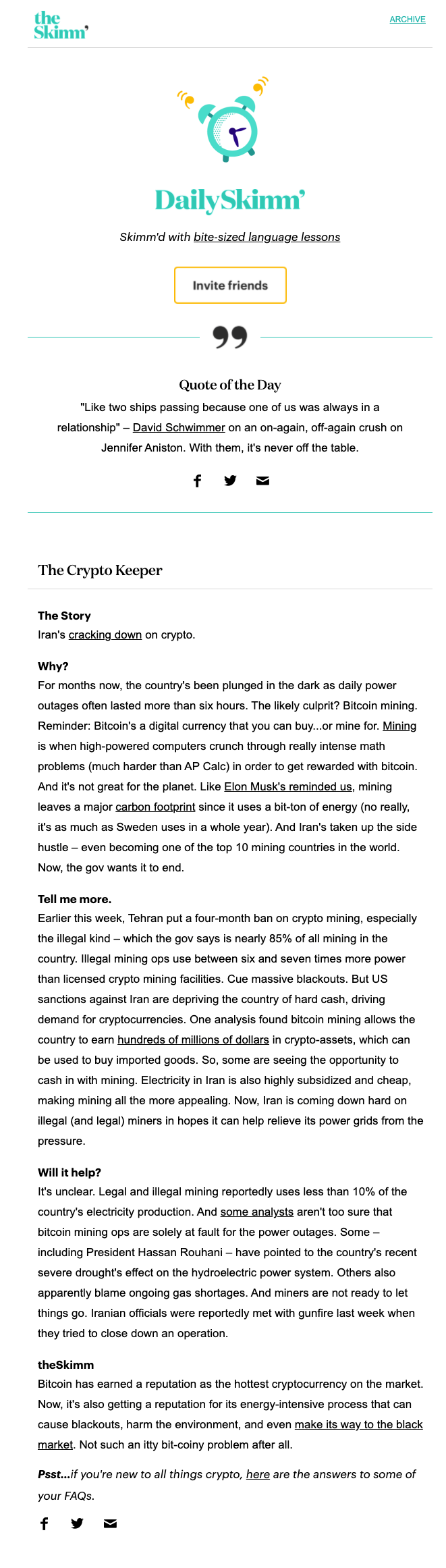
The Good:
- Their snarky pop culture references make the news more interesting for those less inclined to read or consume the news daily.
- Their branding is obvious and on-point. From the simple illustration of a retro alarm clock to the hip green palette, they are targeting a very specific audience of females in their 20s and 30s—and doing it well.
The Amazing:
- It looks great. Their font choice, the story format and layout, and the headers make everything look well-put-together while still easy to read. They don’t even use images!
- They break it down. Complicated news stories are broken down into the main takeaways and spiced up with cheeky copy that keeps people engaged.
- They make it personal. In every email, they shout out to all their subscribers who are celebrating career milestones and birthdays. Their style makes readers feel like the newsletter is just a candid conversation between friends.
The Takeaway for Employee Newsletters:
- Make it accessible. Ditch the corporate talk and adjust to the literacy and knowledge level of your audience. You don’t need to make it more complicated than it has to be.
- Talk to your audience in their language. Use memes, stats, videos, quotes, images—whatever you need to meet your audience where they are at.
- You don’t need images to make your newsletter look good. Experiment with brand colors, lines, headings, and other small customized details to make an impact without having to use and source images.
Newsletter Example #3: Next Draft
Next Draft is like the smarter older brother of the Skimm and the Hustle. It is more mature and strikes a beautiful balance between the long form and short form newsletter. The breakdown makes the content easy to digest but informative, without being boring or superficial.
And they’ve got plenty of social proof: All the best writers and journalists love this newsletter, according to the sign-up page.
Fun Fact: The author, David Pell (self-proclaimed editor of the internet), was sending out newsletters before it was cool. That’s right, pre-internet he was sending out daily news roundups to his friends and colleagues. He’s the original newsletter master.
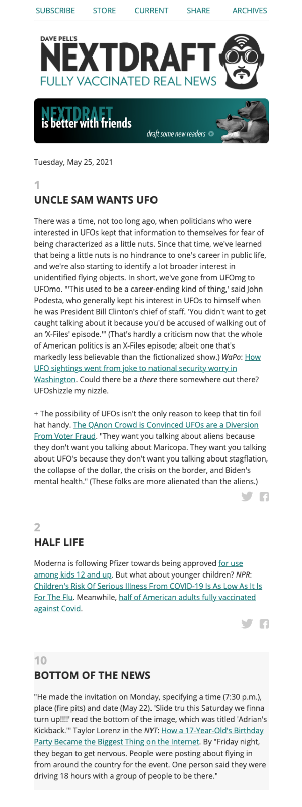
The Good:
- He only ever focuses on ten topics and ranks them from most important to least important. This means you know you are getting the most talked-about news of the day and nothing more.
He takes a well-rounded approach by supplying a number of links and takes on a single issue.
The Amazing:
- He’s able to condense the complicated and nuanced into a couple of sentences and a killer headline to give you the gist.
- His writing is fantastic. He combines a journalistic approach with the snappy wit of your favorite uncle. The combination makes him come off as serious, without being boring, and personal without being too sentimental or cheesy.
- His design is simple and lovely to read on mobile. The fonts and design are so attractive that he doesn’t need images to make the newsletter aesthetically pleasing.
The Takeaway for Employee Newsletters:
- You don’t have to be silly, controversial, or immature to be interesting. Good writing is good writing.
- Narrow down your focus to just ten topics and make them snackable. Rank them from most important to least, so employees know what they absolutely need to know.
- Leverage different sources on the same story. For example, if you have a favorable customer story in the media, include insight from the various employees who facilitated the success.
- Nourish your readers with insight that will make them more informed and engaged in what’s going on. Straight facts are fine, but perspective is more valuable.
Newsletter Example #4: DN Digest
DN (Designer News) Digest is the first newsletter on this list that actually leverages images in its newsletter design. That’s no coincidence. Images can be a double-edged sword: They can either distract or draw readers in. As designers, DN knows how to draw people in with the right images and colors that don’t distract from the content.
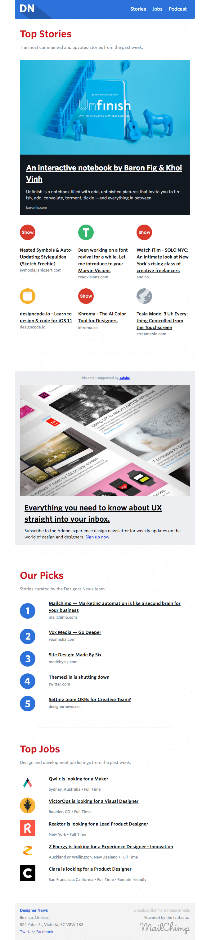
The Good:
- It is design-focused without being design-heavy. It proves that when it comes to great design, less is more.
- It’s light. They know how to balance text and images so that the bolder the image, the less text they write. They make good use of links to keep the design clean and clutter-free.
- They know what their readers want. All the content is relevant, short, valuable, and nested in colored blocks that make the information the reader is looking for easy to find.
The Amazing:
- They know how to balance color, iconography, formatting, and images to create an easy-to-read newsletter that draws your eye to the most important information.
- The use of iconography helps repeat readers identify what kind of content is beyond the links so they can find what they want easily.
- They keep it concise and engaging with lists. Everyone loves a good list, but their lists go above and beyond by being relevant, valuable, and easy to scan. They display all the important information the reader needs to know before they decide to click.
The Takeaway for Employee Newsletters:
- Your design should provide a good user experience. And in the case of newsletters, designers know that less is more. Help people find want they want easily, without cluttering up the email with tons of content or images.
- Images don’t need to be big or pretty. There is no need to scour the internet for hours looking for the perfect stock photo for your feature. You can create an attractive newsletter with fonts, icons, and simple color blocks.
- Use color and images to feature different content strategically to guide your reader through the information.
Newsletter Example #5: Niice Review
Niice’s Review newsletter is another example of an external-facing newsletter that has a lot of lessons for internal communication pros. Niice is a brand asset manager for in-house creative teams, so let’s just say they know what they’re doing when it comes to engaging designs and branding.
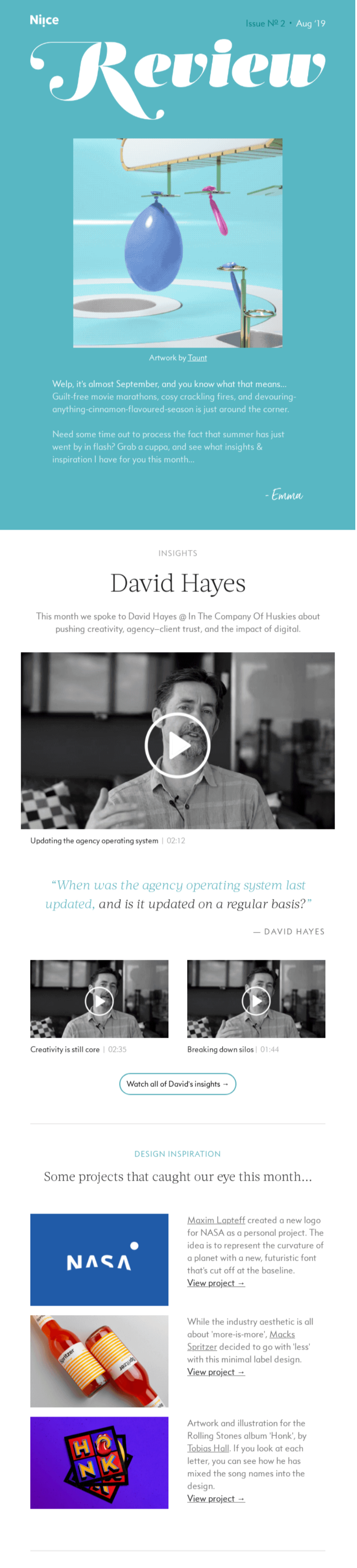
The Good:
- They make use of both white space and color blocks in a way that feels light and easy to read.
- They include just enough content to keep you reading, but not so much that it’s overwhelming. The entire newsletter can be consumed at a glance.
The Amazing:
- Complimentary CTAs. Every call to action is different, perfectly matched to the copy, and uses action verbs like “Watch,” “View,” and “Request”.
- The layout is eye-catching. They make excellent use of different layouts throughout the design, to keep the reader engaged and moving through. Each block draws your eyes downward, urging you to read more.
- Dynamic content. They incorporate lots of different kinds of content, from video and quotes to illustrations and screenshots. They know how to use complementary media types to keep the reader engaged.
The Takeaway for Employee Newsletters:
- You can mix it up, as long as it’s complementary. Don’t be afraid to try out different layouts, CTAs, and content combinations in your content blocks. Just make sure they complement each other and tell a cohesive story.
- Include something for everyone. Your employees are all different, so not everyone will enjoy the same kind of content. By including different media like videos, quotes, and blog links, you’ll ensure that everyone who reads your newsletter finds something they enjoy consuming—and actually looks forward to reading.
Newsletter Example #6: rooki.design
Surprise, surprise, another design-focused company putting out an amazing newsletter. This one is a (now defunct) online magazine for design students.
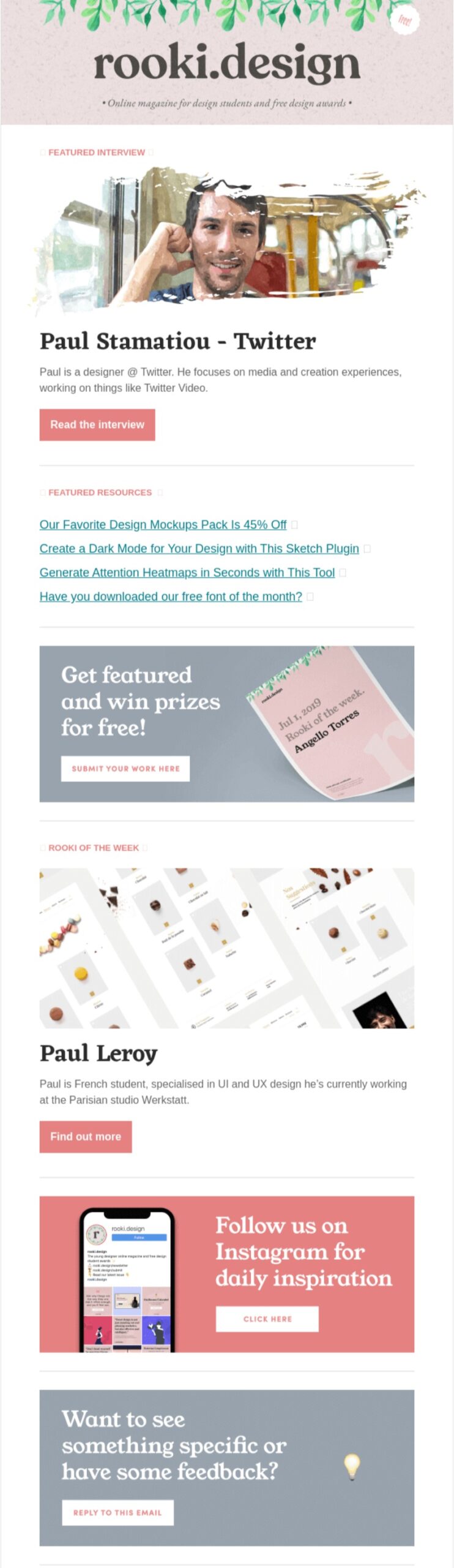
The Good:
- It’s short but info-packed. It makes great use of links to other content while giving you enough info to decide which links are important to you. And their “Featured Resources” headlines are .
- Clear calls to action—you know exactly what to click and what’s going to be on the other side.
The Amazing:
- Strategic color use. They picked a few and stuck to them, using them at various points and inverting them to create a dynamic design that doesn’t stray from the brand.
- Beautiful header. It’s stunning and sets the design tone for the rest of the newsletter.
- Font choice. They use a visually appealing serif font for headers, but regular, easy-to-read fonts for actual content.
The Takeaway for Employee Newsletters:
- Clear CTAs are crucial. If you want your readers to take action, tell them exactly what you want them to do—“Read the Interview,” “Submit your work,” “Click here”.
- Don’t overstuff. Less is more. Choose a few key messages that you want to share. Bonus: The less content you have to write, the more time you can spend crafting the perfect messaging.
- Get creative with your branding. Access your inner Picasso and have fun with branding in your employee newsletter. Use all the colors in your brand color palette. Ask the design team to create a beautiful, inviting header that can be used in every issue. And don’t be afraid to try out different font pairings. This free tool can help.
Newsletter Example #7: The Art of Work
This popular bi-weekly newsletter from hiring software company Homerun covers hiring, company culture, work/life balance, and more.
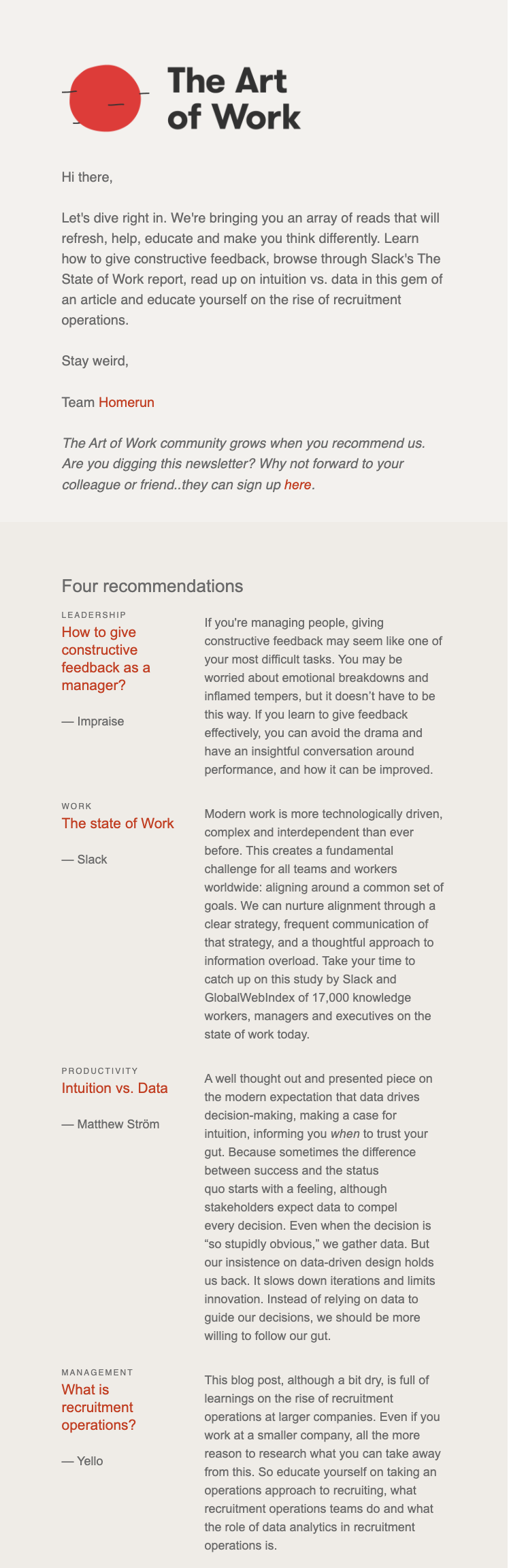
The Good:
- I love their unique, eye-catching, and easy-to-read design.
- They get right to the point with four recommendations. Every issue is the same thing so I know exactly what to expect.
The Amazing:
- Their resource descriptions capture the core message of the piece and do a great job explaining why you should read it.
- The colors and layout they’ve chosen are easy on the eyes, so you can really spend some time reading through without being overloaded
The Takeaway for Employee Newsletters:
- It’s okay to narrow your focus to just a few key messages.
- Text-heavy is fine, so long as you have a clearly structured design.
- Consistency is key. If employees know what to expect each time, they’ll have to use less processing power to read through it and will know where to find their favorite content.
Newsletter Example #8: 3-2-1 Thursdays by James Clear
Okay, disclaimer: This is my favorite newsletter of all time, so I am a bit biased.
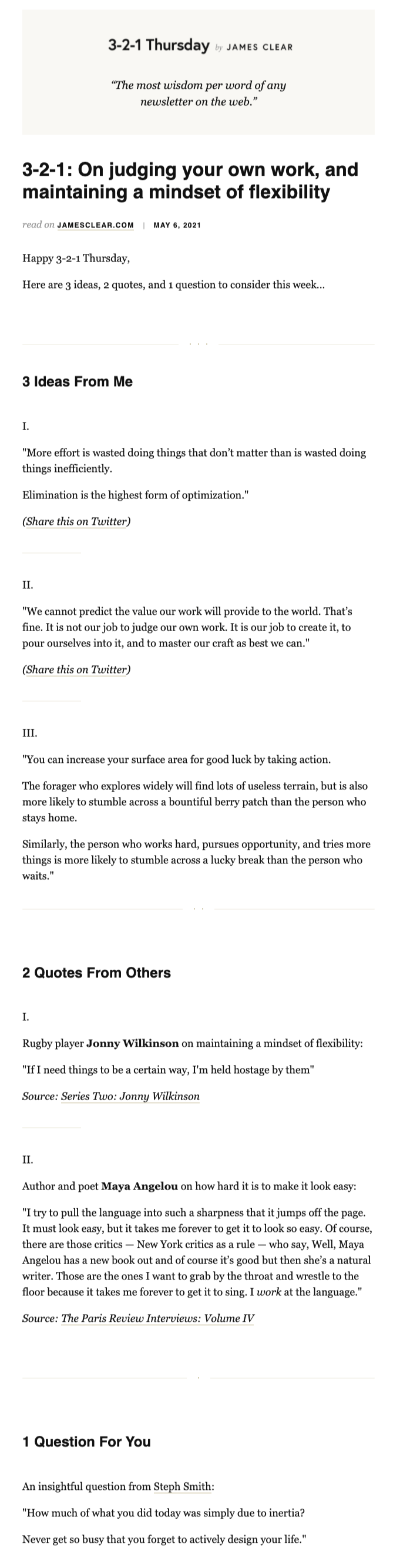
The Good:
- The simplicity of the design allows you to focus on the content. No color, no images, just what you came for. It allows his content to shine.
- The content is designed to be shared, and he makes it easy by including ready-to-use Twitter links.
The Amazing:
- The 3-2-1 concept is unique. Like other newsletters I’ve included here, having a consistent angle, format, or way you tackle content each week allows the reader to expect and become familiar with how you present information.
- By sourcing quotes as his primary content type, he’ll never run out of content. Genius.
The Takeaway for Employee Newsletters:
- You don’t need design skills to create a visually appealing newsletter. You don’t even need images if you use whitespace effectively!
- Everyone needs a little inspiration. Our funny little human brains love gossip and hearing what other people have to say. That’s why quotes are such a great content type. They look great in newsletters, can inspire and give your employees food for thought, and they’re super digestible and memorable.
Newsletter Example #9: Letters by Fenwick
This is the most consistently forwarded newsletter in my inbox. It’s the perfect mix of great writing, simple but effective design, and truly engaging content. I get excited when I see a new issue in my inbox because I know I’m going to learn something new.
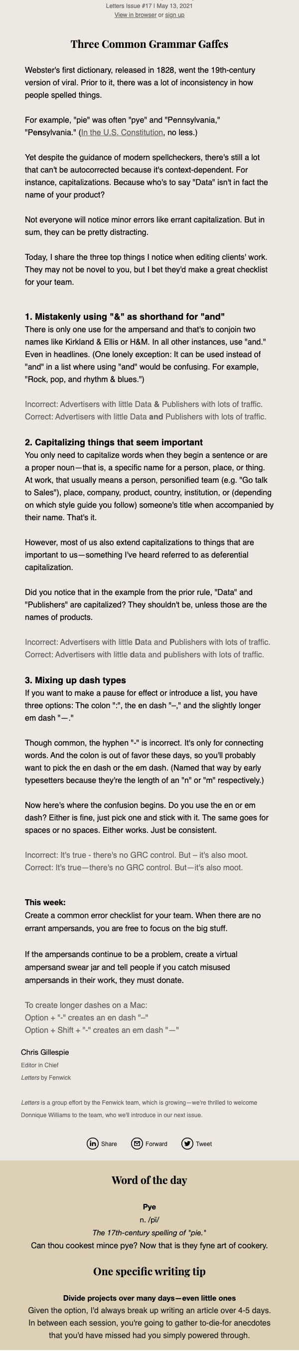
The Good:
- The design is super simple but effective. Their content is text-heavy, but instead of breaking it up with images, they use colored content blocks to separate the sections, and it works really well.
- They choose one topic and use it throughout the newsletter to reinforce different points. (Notice how the “Word of the Day” and “One specific writing tip” connect to the main story?)
The Amazing:
- The writing. I could go on and on about the writing. It’s so smart (I want to say “erudite”… does that make me a snob?) but also chatty and informal. Reading Letters feels like you’re talking to the smartest and most interesting person in the room at a party.
- The writing. Take a minute (or an afternoon) reading previous newsletters if you don’t believe me. Enjoy.
- The writing. Seriously. It’s so good.
The Takeaway for Employee Newsletters:
- Great writing is the key to keeping your readers engaged.
Newsletter Example #10: Thrive Market
Thrive Market is an organic, all-natural, and sustainable food delivery service.
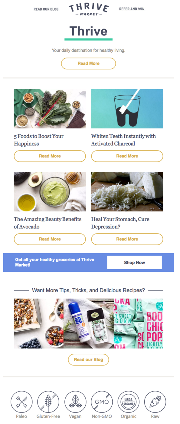
The Good:
- The layout is nicely balanced, with repeating blocks of four headlines, images, and CTAs broken up by full-width images to avoid monotony.
- You can tell from their newsletter design that they know their target audience really well. They focus on exactly what customers are looking for.
The Amazing:
- Their headlines are enticing, with a compelling mix of listicles, how-to’s, and questions.
- They reinforce their company values with simple illustrations near the end of the newsletter. Very clever.
The Takeaway for Employee Newsletters:
- Use marketing hacks—power words, emotional words, numbered lists—to write better headlines that your employees will actually click on.
Tip: If you’re looking for some headline help, this free tool from CoSchedule analyzes your headlines for sentiment, length, clarity, and more.
Newsletter Example #11: Robinhood
Stock trading app Robinhood publishes Snacks, a daily newsletter about financial news that can be read in three minutes.
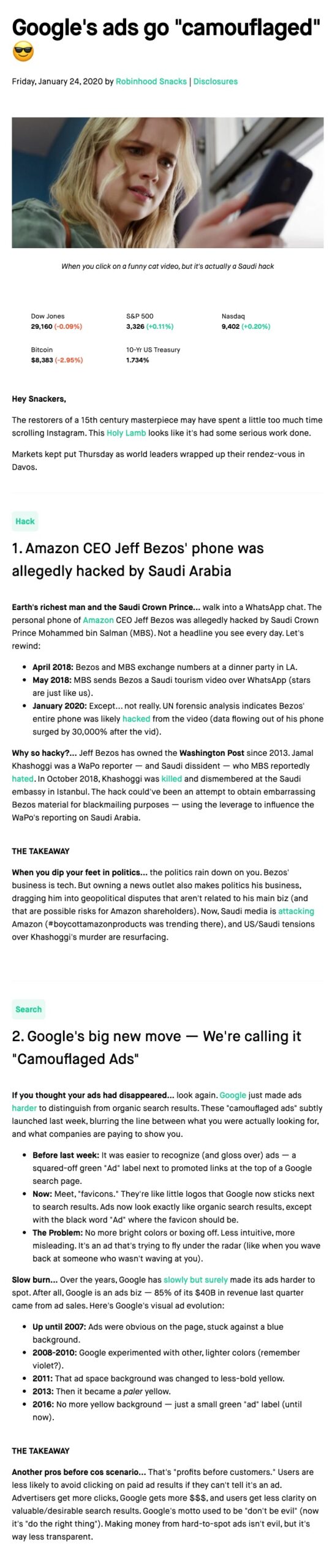
The Good:
- I love their use of whitespace combined with a splash of color for links and important information.
- I don’t know about you, but I’ve never been one to read about stocks for the fun of it… but somehow Robinhood makes financial news captivating?
The Amazing:
- Their copy is really smart. They take a dry and complex topic and pack it full of sly pop-culture references that make it a joy to read about… stock trading. Now there’s a sentence I never thought I would write.
- Their commitment to making it snackable (hence the name) is clutch. By letting people know up front that it’s not a huge commitment, people are more likely to click and read through.
The Takeaway for Employee Newsletters:
- If you have to relay dry company information (and you will), use a simple layout and pack it with engaging, light copy to keep your readers hooked.
- Make it snackable! Don’t require employees to book off a half-hour in their day just to go through all the content—ain’t nobody got time for that!
Newsletter Example #12: Resy
The restaurant reservation platform Resy produces a mouthwatering At Home Hit List. This edition celebrates restaurant reopenings in the Bay Area.
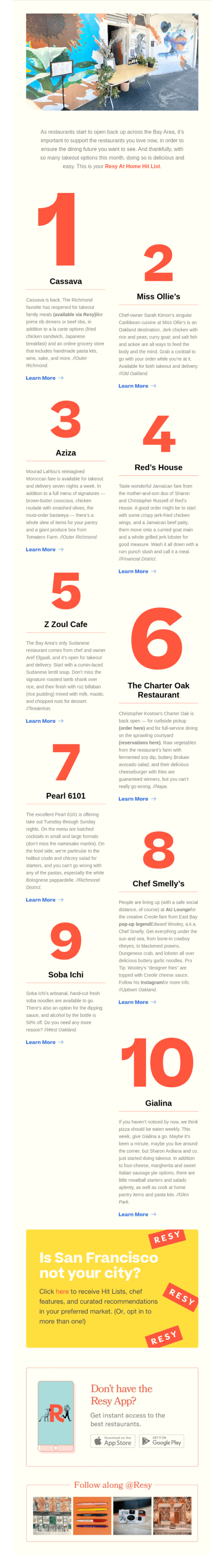
The Good:
- I love that they resisted the urge to include food photography and instead chose a big, bold design featuring numbers—perfect for this numbered list. This just goes to show that subverting expectations can be very effective.
The Amazing:
- Resy newsletters are customized based on the reader’s city, so you’ll never receive a newsletter that isn’t relevant. Hello, targeted communications!
- They include more segmentation options, plus links to download their app and follow them on Instagram, at the bottom of their newsletter. I love that the added content doesn’t interfere with the numbered design at the top, but still stands out.
The Takeaway for Employee Newsletters:
- Segment, segment, segment! It’s not the sexiest topic, but segmenting your employee lists will make your communications more impactful, and help you avoid every communicator’s nightmare, the dreaded all-staff email.
- If you want employees to read your emails, you better be sending them relevant info.
Newsletter Example #13: Oscar Monthly
Health insurance can be overwhelming and scary, but Oscar makes it accessible and even fun with their empathetic approach.
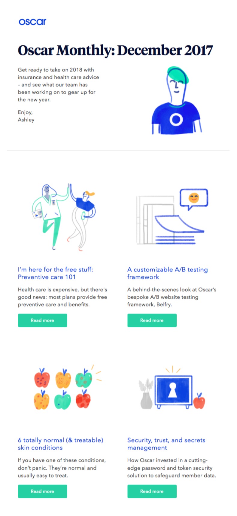
The Good:
- They include an impressive mix of product content and general interest content—and the headlines for their general interest articles are really well done.
The Amazing:
- Their illustrations make my heart happy. I know I am always going on about whitespace, but that’s mostly because I am not a designer. Custom iconography and illustrations are a wonderful way to give your newsletter a real personality, or look and feel that people can relate to.
- I like that Oscar Monthly is from “Ashley”, instead of a faceless corporate entity. It makes sense that Oscar, which focuses on simplifying health care for consumers, would use small touches like this to make their content more human. It’s a pretty common marketing trick, but it works for a reason.
The Takeaway for Employee Newsletters:
- Make it personal. As an internal communicator, your job may be to represent the company and share important information with employees… but you’re so much more than that. You’re fun, personable, and empathetic. Your company newsletter is a great channel to show off your sunny personality and flex those communication skills. Authenticity will always resonate.
Newsletter Example #14: Ueno
Ueno is was a full-service marketing and design agency that creates digital experiences. They are no longer in business but I don’t care, I still think they have one of the greatest newsletters of all time.
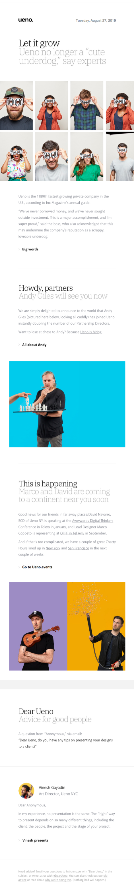
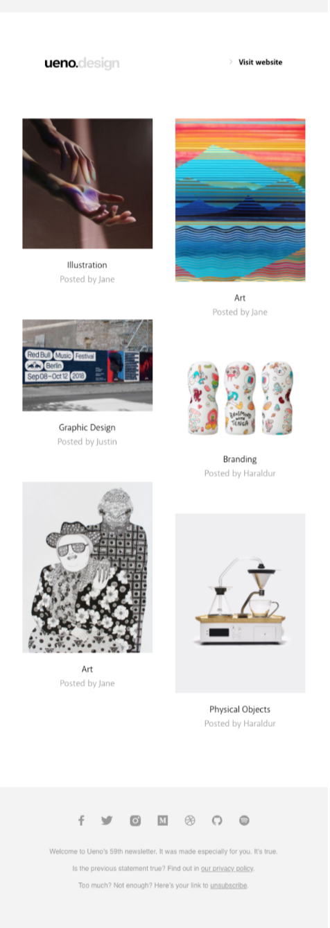
The Good:
- I’m starting to sound a bit like a broken record, but… White space, white space, white space.
- Impressive use of branding colors, fonts, and image styles.
The Amazing:
- The copy is fantastic. Self-deprecating, chatty, and fun. I want to read every word.
- Their images perfectly reinforce their brand tone and fun copy.
- Even the footer copy is golden! It’s one of the rare newsletters that I actually want to read from top to bottom.
The Takeaway for Employee Newsletters:
- Plant Easter eggs in your newsletter (like Ueno’s hilarious footer copy) to keep your teammates engaged. You could even make a game of it and plant something new in every issue, with prizes for the first employee who spots the change. A little gamification never hurt anyone!
- Images of your people should never be stock photography. And the more you can capture the feel, look, and brand vibe with your photos, the more interesting and engaging your newsletter will actually be.
Newsletter Example #15: Flock
Flock is a productivity and collaboration tool for distributed teams, so it’s no surprise that their newsletter prioritizes interactive content.
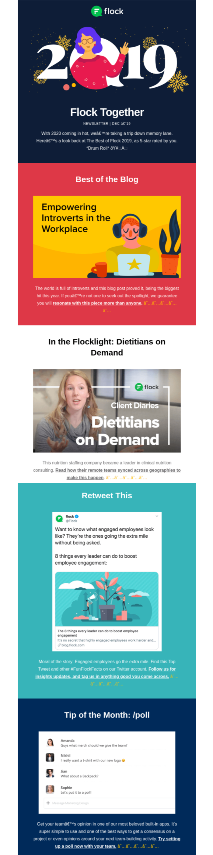
The Good:
- The bold design and color palette are especially eye-catching.
- Even though they are using lots of color, they are using it strategically, not willy-nilly.
- Every block is its own little world, helping us compartmentalize the information.
The Amazing:
- They include a great mix of shareable and interactive content.
The Takeaway for Employee Newsletters:
- Give your readers something to do with interactive content like surveys or shareable tweets!
Newsletter Example #16: G2
G2 is a tech marketplace where users leave reviews for SaaS products. In this issue of their newsletter, they highlight their success over the last year… but in a way that’s actually pretty interesting without being too brag-y.
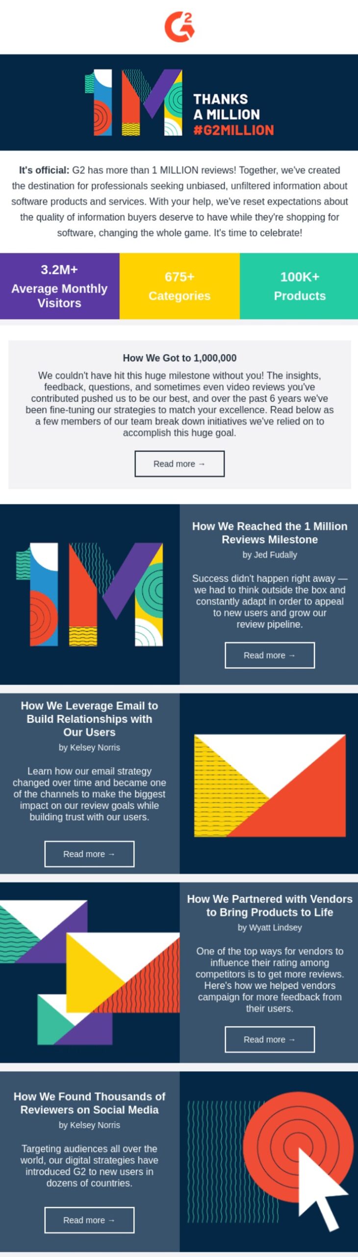
The Good:
- I love their bold colors and images.
- The repeating and reversing layout style is a great way to draw the eye downward.
The Amazing:
- Repeating brand elements like color and certain iconography is used consistently throughout the design to create a cohesive look and feel.
The Takeaway for Employee Newsletters:
- Branding is your friend. Find new ways to bring in your brand through color choices, iconography, images, and your newsletters will always look professional and you can feel proud hitting send.
Newsletter Example #17: Blinkist
Blinkist is all about curating bite-sized knowledge from a variety of sources.
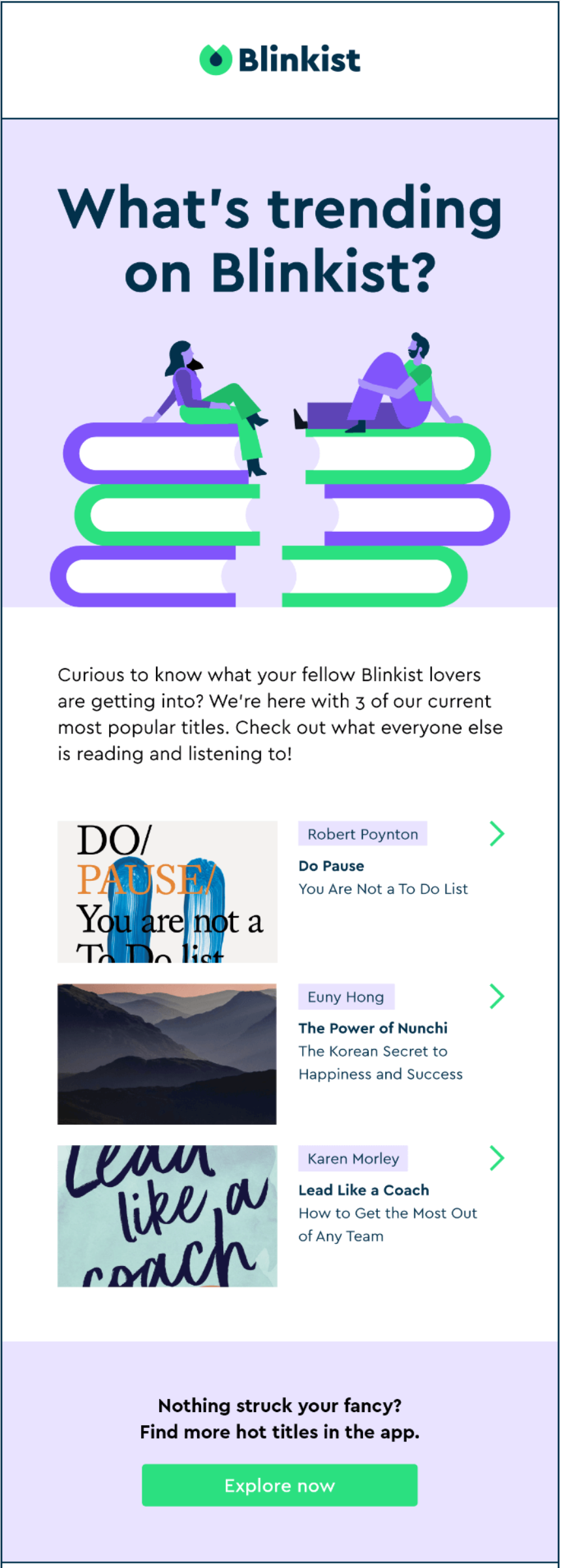
The Good:
- Great use of color—even though the colors are quite striking and could be overwhelming if used poorly.
- Everything reinforces the brand, from link text to CTAs, to iconography.
- The power of FOMO, baby. Do I want to know what the other cool kids are reading, watching, and listening to? Why, yes I do!
The Amazing:
- It delivers on their promise to curate bite-sized knowledge: It’s short, sweet, and highly effective.
- The minimalist approach to content makes for a super readable, snackable newsletter. I always read the Blinkist newsletter because I know that it will take 30 seconds, tops, to scan and digest their content.
Tip: Use the 5-second test to drastically improve your internal newsletter.
The Takeaway for Employee Newsletters:
- You don’t need to pack your newsletter with content. Experiment, test, and measure to find out what content your employees care about and give the people what they want!
- Share trending information. Just because lots of people have already read an article on your intranet, doesn’t mean everyone has. If it was interesting to other folks, it’s likely to appeal to more people who just haven’t had the opportunity to read it yet.
Newsletter Example #18: Daily Dose
The Daily Dose is just one of the many newsletters created by media and entertainment company OZY.
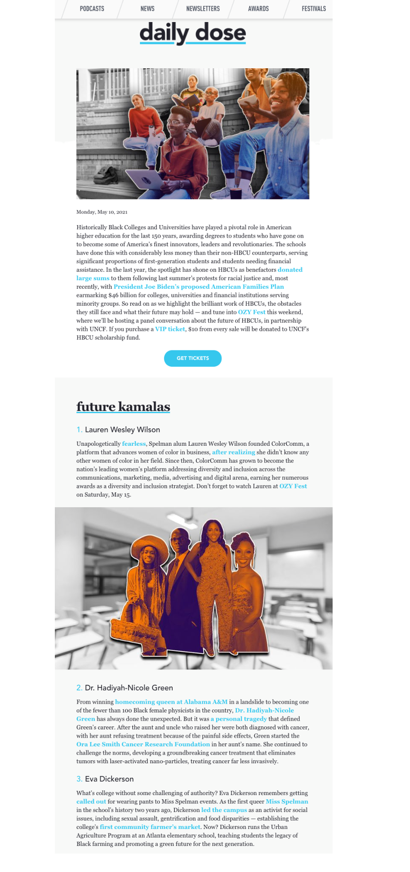
The Good:
- They have a fresh perspective and write about stories that major publications don’t cover, with a focus on diversity and challenging the status quo.
- They tackle challenging and sometimes controversial topics in depth. I always feel like I’m getting the full story.
- Great use of consistent color—the link text and CTAs are blue, which pulls the content together, and the splash of contrasting orange in the header images is intriguing.
The Amazing:
- Every issue is a themed deep dive into a different topic. I can’t imagine the effort it takes into writing, then curating the articles that go into a single issue.
- They take images to the next level by adding illustrations that really pop. I love this design style, mixing the real with the artistic. I’m here for it.
The Takeaway for Employee Newsletters:
- Don’t be afraid to go deep. If you have a fresh perspective on a topic that’s relevant and matters to your employees, dig in. Tell the story.
- Build your design around a few key colors. Have fun with your brand colors to make your designs memorable and consistent.
Newsletter Example #19: Staffbase’s Biweekly Newsletter
You know we had to include this, right?
If you aren’t already subscribed to our biweekly You’ve Got Comms newsletter, you can subscribe here.
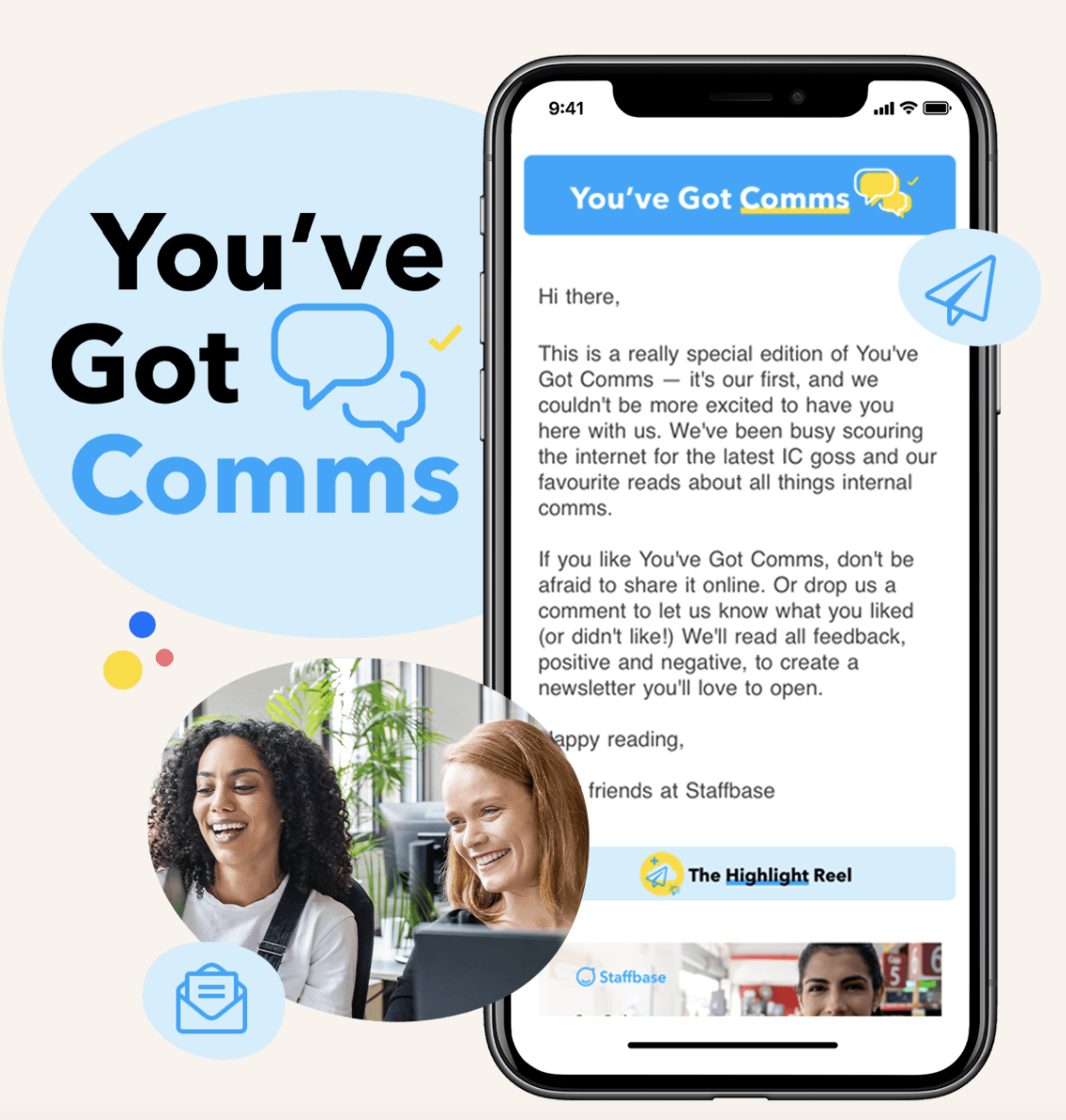
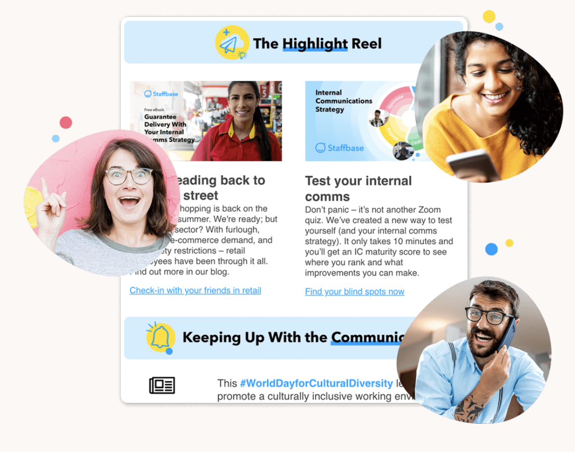
The Good:
- Emojis. We break up lines of text with emojis that draw the readers’ eye from one point to the next. Think of them like bullet points, but way more fun.
- Super scannable. Each section header is consistent with our brand and has a distinct image so you can easily tell which section is which.
The Amazing:
- Round up of the latest industry news. We keep our ears to the ground to find out everything that’s happening in the IC world, and deliver it in a bite-sized way for our audience.
- Themed and personal. Every issue, there’s a different theme (the one above is all about email) and a little intro from a Staffbase employee. It’s a nice touch that makes our audience feel like they’re getting a personalized newsletter each time.
The Takeaway for Employee Newsletters:
- If your content is solid, you don’t need a fancy design to keep your readers engaged. A few emojis and splashes of color (like our yellow CTA buttons) can transform an otherwise plain email into something super easy to read and engaging.
- Know your audience. It makes a huge difference if you actually care who you’re writing for and what you’re writing about. Keep track of industry news that’s relevant to your readers—they’ll appreciate the effort. Plus, empathy goes a long way to building a loyal readership.
Newsletter Example #20: Staffbase’s Longform Employee Newsletter
This is a modern long-form newsletter template we designed, available to all Staffbase customers in the email designer.
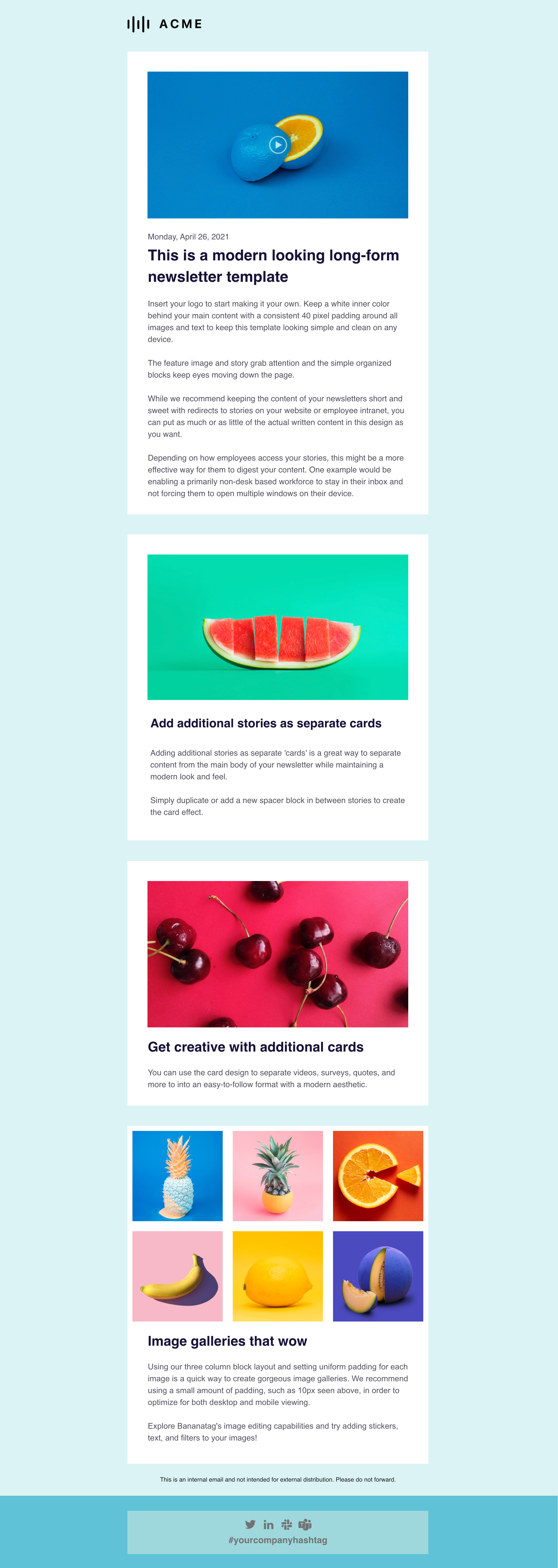
The Good:
- The feature image and story grab attention and the simple organized blocks keep your readers’ eyes moving down the page.
The Amazing:
- You don’t need any design experience to make this look great!
- You can totally customize this to fit your branding or your content, easy peasy.
The Takeaway for Employee Newsletters:
- You can include a ton of content in your company newsletter if you break it up with a modern, well-designed template.
Newsletter Example #21: Staffbase’s Leadership Update
This template is designed for sending a personalized message on behalf of leadership. Again, this one is available to all Staffbase customers.
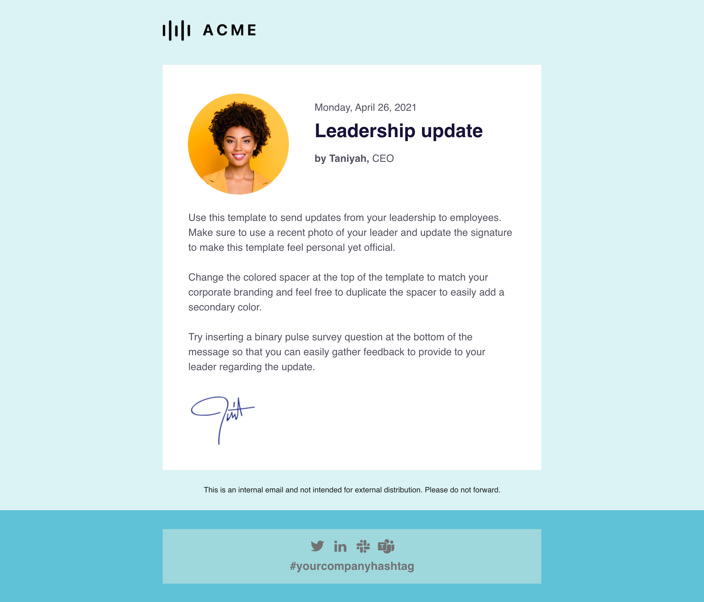
The Good:
- Ok, everyone knows the CEO didn’t write it. (Sometimes it’s more obvious than others…) But the small personal touches like an up-to-date headshot and signature help make this feel like a real email from leadership.
The Amazing:
- You know I love a Pulse Survey. With this template, you can easily insert a binary pulse survey question at the bottom of the message to gather feedback on the update that you can relay back to leadership.
The Takeaway for Employee Newsletters:
- A clean, simple design is best for leadership updates. Keep the focus on the message.
Newsletter Example #22: Staffbase’s Crisis Response
There are times when you will have to deliver an important, time-sensitive update in response to an issue or crisis. So we got feedback from a load of comms pros and created this template with all those best practices in mind.
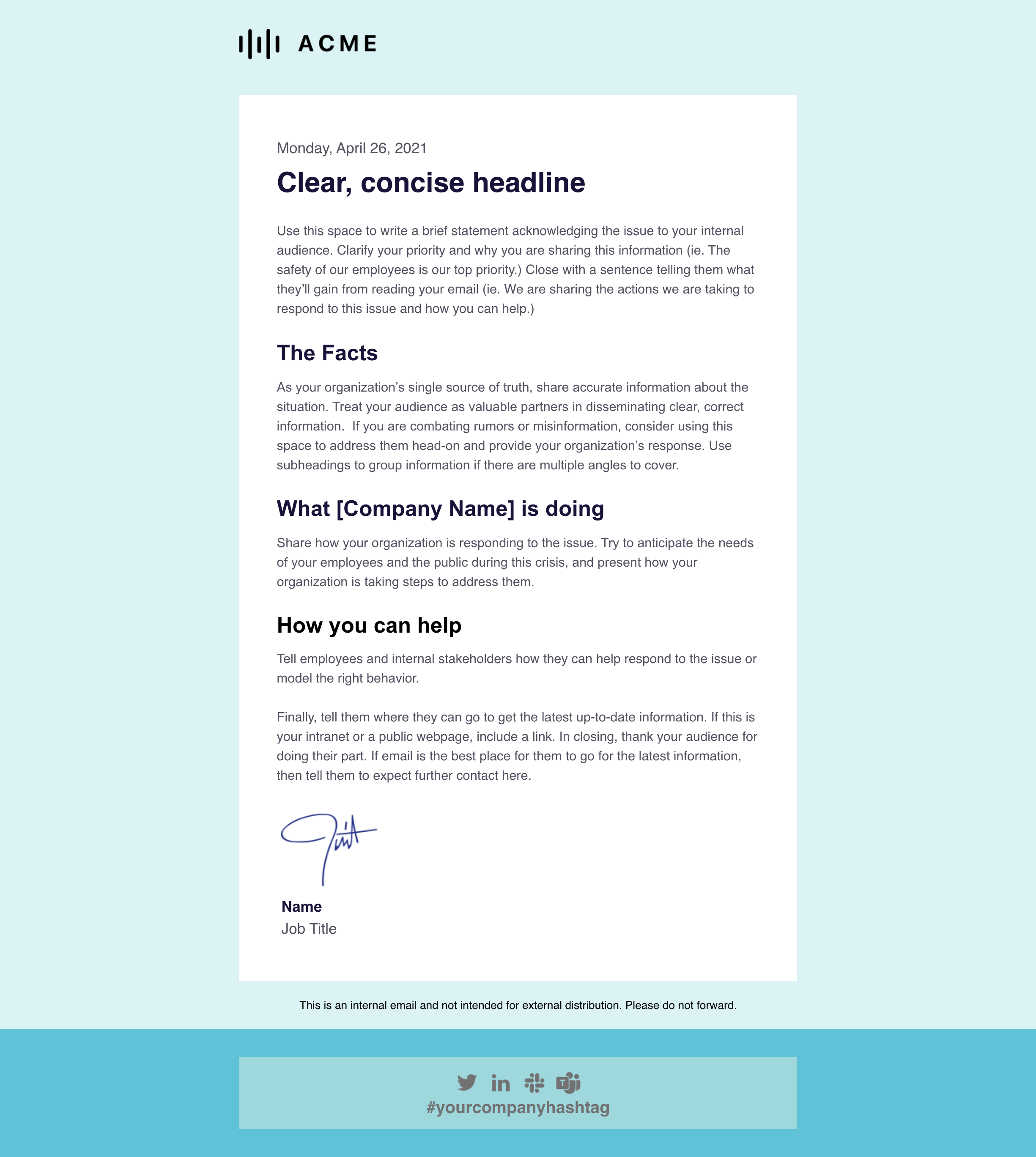
The Good:
- It gets right to the point with a clear, concise headline. In times of crisis, you’ll want to communicate directly and avoid fluff.
The Amazing:
- This design prioritizes information over “making it pretty.”
The Takeaway for Employee Newsletters:
- Function over form is crucial when it comes to crisis communications. There’s no time to mess around with fussy designs during a crisis, so having a design like this in your back pocket is super useful.
Newsletter Example #23: Staffbase’s Remote Work Check-in
Now that it looks like remote work might be a permanent thing for a lot of organizations, it’s really important that you keep checking in with employees, making sure they have what they need to do their best work from home.
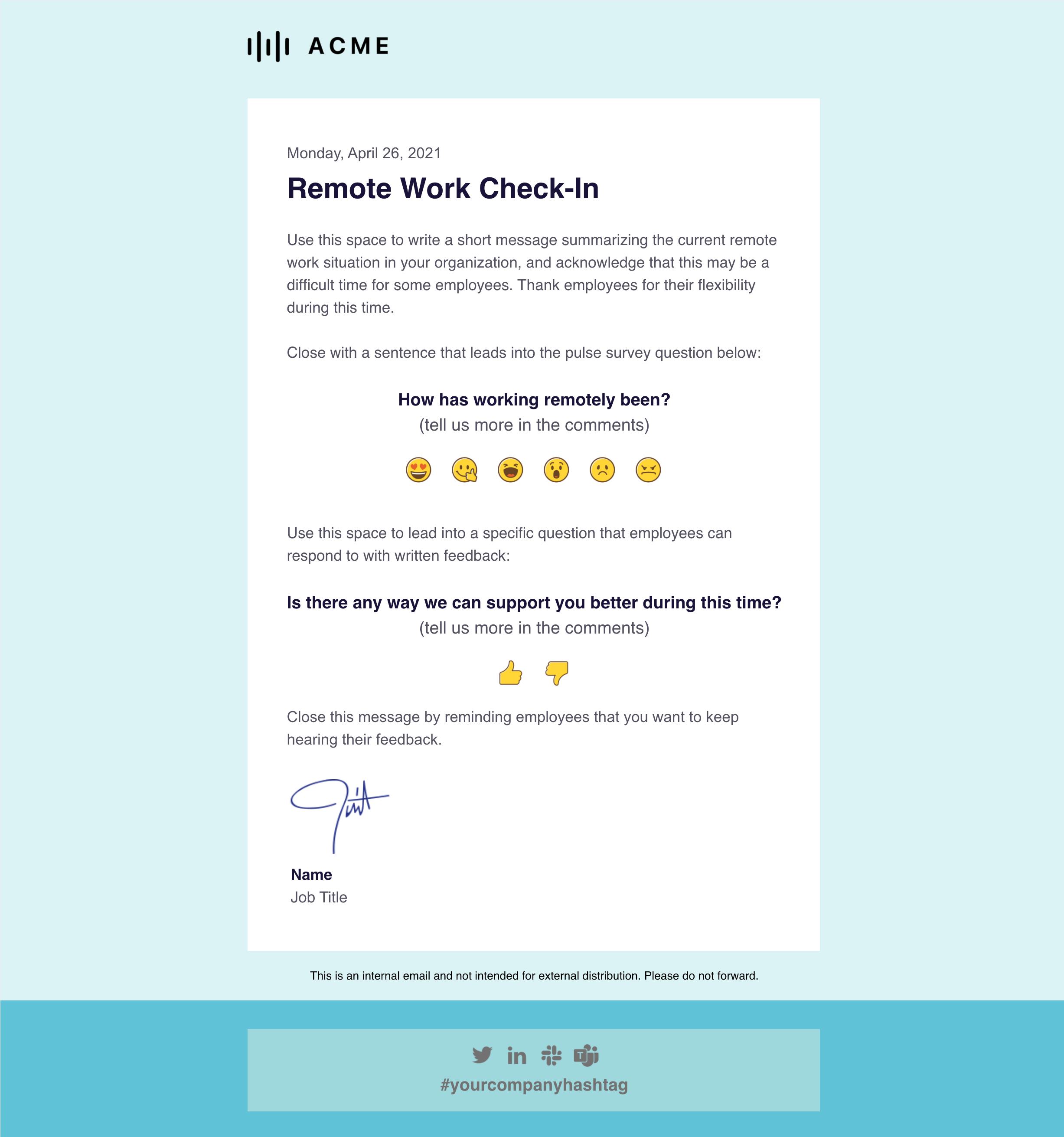
The Good:
- This is a thoughtful way to show that your organization cares, especially when it’s not crammed into a long newsletter as an afterthought.
The Amazing:
- So I just Pulse Surveys and Social Reactions. But you knew that already.
The Takeaway for Employee Newsletters:
- Ask for feedback! And remember to share the results in the next newsletter, along with action items for how you’re addressing employees’ concerns.
Newsletter Example #24: Staffbase’s Short-form Newsletter
This little one is a great jumping-off point for your own design, or for keeping your newsletter light and tight.
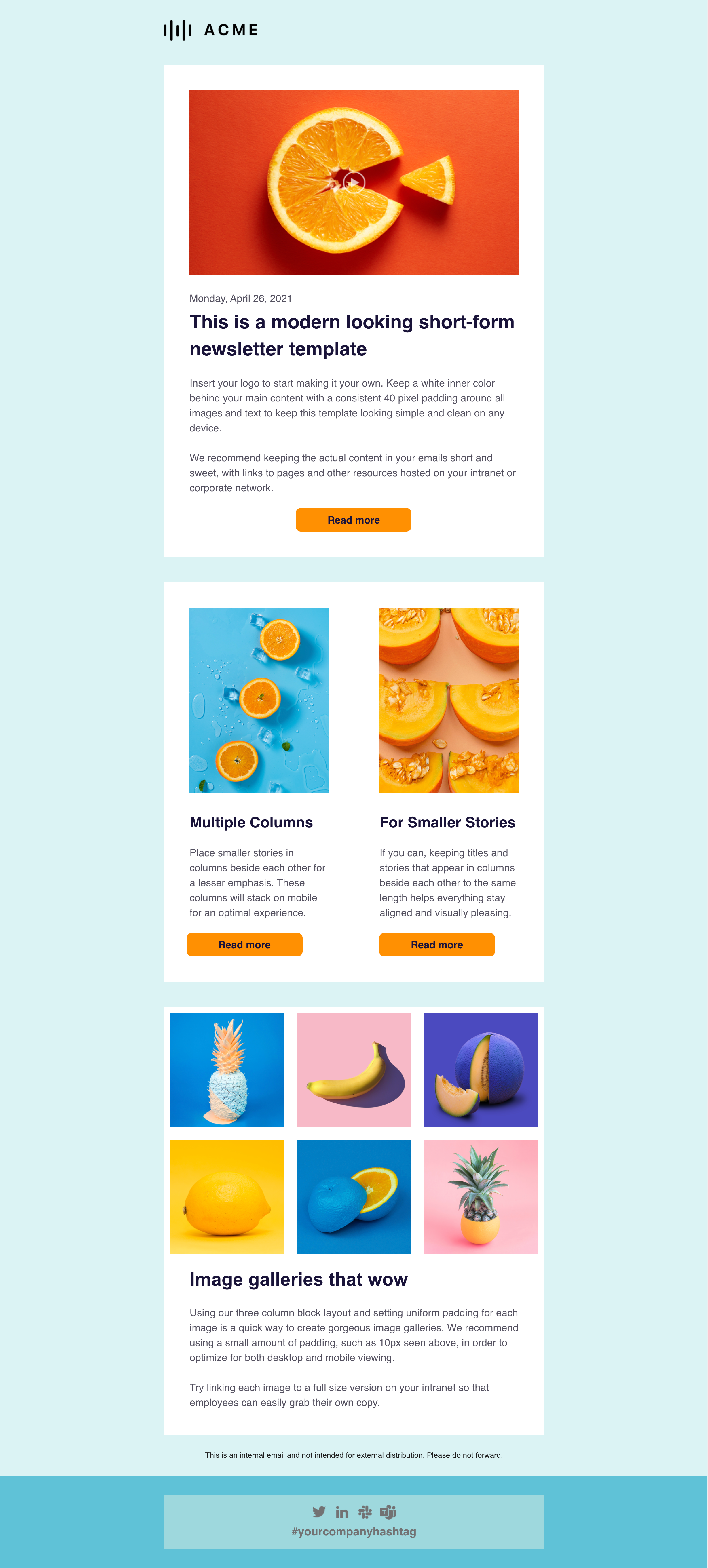
The Good:
- This is one of the most readable templates and it’s so easy to master!
- It’s a great way to direct employees to your intranet or company network.
The Amazing:
- It’s perfect when you have a variety of links to share but want to keep your newsletter punchy and snackable.
The Takeaway for Employee Newsletters:
- Short can be sweet. Your newsletter doesn’t need to have or be everything—linking out to your intranets or internal blog is a great use of this channel.
Newsletter Example #25: Love Notes by ME
Oh, what’s this?
Another incredible design from a complete non-designer, aka ME!
That’s right, I made this one too. 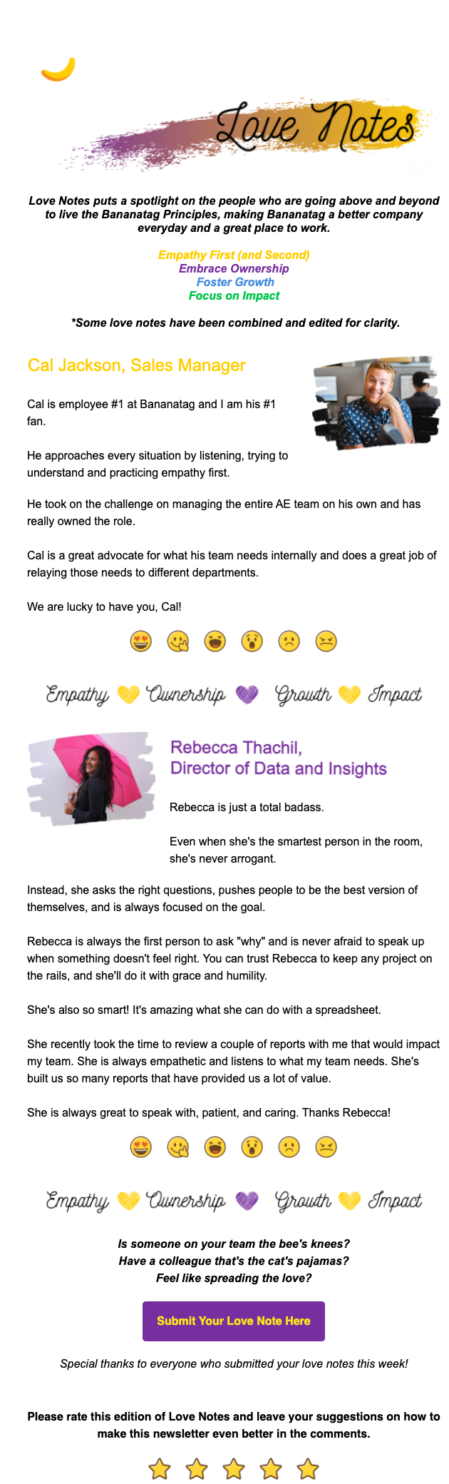
The Good:
- I tried very hard to make the design and the copy all contribute to the same lovey-dovey vibe, and I think I did a not-terrible job.
- The spacer image includes all of our company values, which is a great way to reinforce them over and over.
The Amazing:
- Celebrating your co-workers feels amazing. I got a ton of great feedback saying people loved seeing this in their inbox first thing on Monday morning and that it really set the tone for the week. Good vibes are priceless.
- Giving people the chance to submit their own content was awesome… because I barely had to do anything. I used a Google form to collect nice notes from and about my colleagues, edited and combined them for clarity, and then threw it in! Easiest, most interesting content ever.
- Employee-focused content will get a lot of interest. Helping people understand what other folks at the company do, and how their work impacts the entire organization is a great way to connect folks and reinforce a positive company culture.
- My colleagues—full stop.
The Takeaway for Employee Newsletters:
- Build mystery. Of course, people were wondering each week if they would be the one of the few featured and complimented, so the email always got opened and fast!
How to Use These Newsletter Examples in Your Internal Email
Unlike the marketers that had to painstakingly craft, test, design, and fail over and over to perfect these newsletters, internal communicators already have an audience that is begging to be engaged.
If you implement the takeaways from these 25 newsletters strategically, you will start to see a big difference in your employee newsletter engagement.
But there’s a lot here to work with, so think about your audience, how they want to interact with your content, and what your goals are for the newsletter.
Not sure where to start? Test drive the Staffbase employee newsletter designer to see how ridiculously easy it is to create beautiful internal newsletters that your employees will actually look forward to reading. Really!