
Let’s start by being frank: you’re doing amazing work.
We’re not here to call your beloved newsletter children ugly and we know they are anything but common.
We are here to show you small tweaks that can have a big impact, showcasing just how damn brilliant you are.

You put loads of work into your newsletter each week/month/quarter and have to jump through Olympic-sized hoops to herd all the cats while keeping everything on brand and consistent.
And try as you might, no one seems to get the memo that — as important as *insert your topic here* may seem, it doesn’t need to be included in every single issue.
While producing the newsletter is a tremendous amount of work for you, it’s also exhausting for your audience. They have to sift through all the information, looking for the few details that apply to them.
Plus, they have to do the same thing for the zillions of messages floating into their inbox day in and day out.
If this sounds familiar to you or if you can relate, you’re not alone.
At Brilliant Ink, we partner with our clients to optimize their day-to-day communications — from newsletters to intranets to all-hands meetings and beyond.
And by far, the most common bugger we come across with newsletters is fatigue. Fatigue on the part of the internal communicator having to chase down all of that content – and fatigue from the readers caused by information overload.
So how can we combat fatigue?
How can we make each newsletter we send out count?
How can we drive up those open and click rates?
By staying laser-focused on what matters.
The reality is: people rarely drown from too much valuable information.
But we won’t know what’s valuable until we ask.

Asking employees what’s valuable (get the dirt).
We have a few different ways we like to arrive at this information. But, believe it or not, our favorite is a good old survey asking employees to rate their level of agreement with this simple statement:
Information on [insert your topic here] is valuable to me.
Create a list of topics you regularly (or not-so-regularly) communicate about by going through your newsletters, intranet, and any other channel or source you have.
Whether it’s 10 business topics or 30, ask your people to indicate how valuable each topic is on a 5-point scale (strongly agree down to strongly disagree). It may seem like overkill but trust us; employees can very quickly work through this.
Of course, the last thing we would do is add survey fatigue to information fatigue. Especially because it is so wonderfully easy to do something with this data to show your people that you’re listening!
It all starts with interpreting your survey results. And, it just so happens that an over-the-counter scatterplot is the perfect way to read the data you’ve collected for this question.
Step 1:
Lay out your topics, lay out your scale, and plot out where everything falls from your survey results.
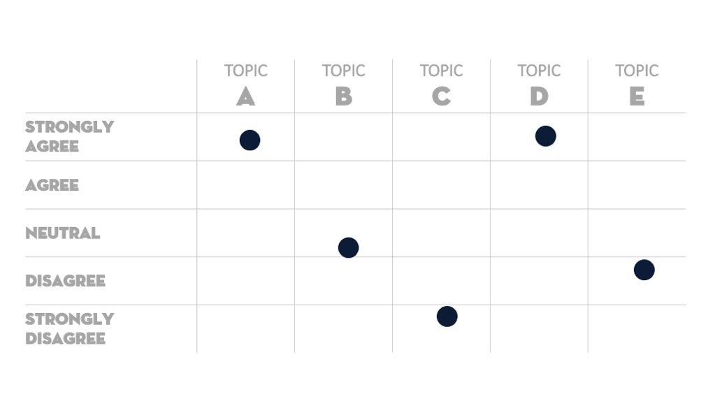
Even though this is helpful, what if you could really make the results sing?
If you apply some simple data visualization tricks, you can immediately make your data more actionable, usable, and easier to interpret. Plus, you can make it much more apparent to your teams and your stakeholders what employees want you to prioritize.
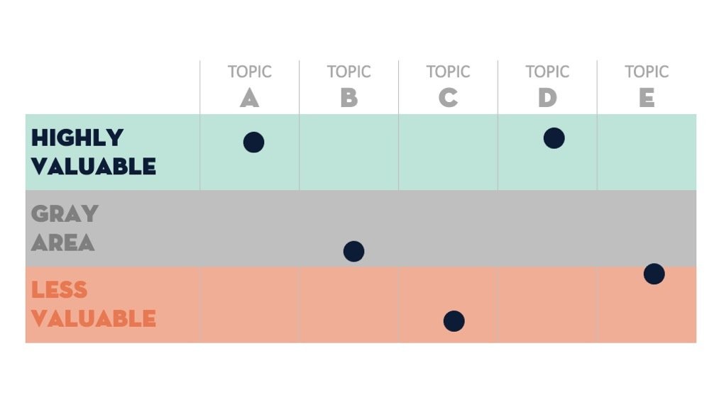
Step 2:
Replace your Likert scale with the English words that actually convey what you’re measuring. There are topics that your audience finds highly valuable, content that’s not at all valuable, and probably a few things that fall into the middle.
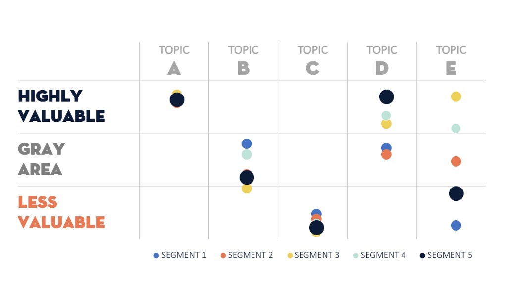
Step 3:
For those of you ready to take this a step further, you can segment out your results by different audiences around the company and see how sentiment around some of these topics can really vary across the board.
Giving employees what they want
Now that employees told you what they want, it’s time to act on that data!
Here are some recommendations for each category:
Highly Valuable
Double-check your newsletters and your editorial calendar.
Make sure there’s a healthy amount of these topics going out in all of your communications — and across all of your channels — not just newsletters.
In addition, find other places where you can source content on this topic to make sure you have a wealth of it on hand, always knowing when the next update will come, how you’ll receive it, and who will send it.
Less Valuable
For topics that are a bit less valuable, limit the frequency.
It’s not that these topics don’t matter, they just aren’t as high a priority or pressing for your people.
So respect their inbox (and their attention span). Rather than pushing the communications out to people, find an alternate channel to house this information and make sure people can find it when they need it.
Gray Area
And, of course, the messy middle. There are topics that some people love, some people just don’t care, and when we average out those survey results, they wind up here.
At one time or another, the entire company might care about and want to hear everything about a particular topic, but preferences can shift over time or vary by region, function, or tenure.
An example of this is COVID-related communications.
At the start of the pandemic, all employees craved information all the time. As return-to-office policies segmented by function, so did the need for specific information. And with lockdown orders so wildly different across the world, different people have profoundly different needs.
For gray-area topics like this, we recommend targeted sends, and letting people opt in or out in the future. You can also consider complementary channels — like a COVID resource center on your intranet.
This also illustrates why it’s super important to do surveys and pulse checks regularly, as preferences and what’s valuable to people change over time.
Don’t rely only on newsletters. Stay focused on what matters.
All in all, your newsletter shouldn’t be the only way employees interact with important information.
From the most valuable topic areas to the least valuable, it’s important to use supplementary, complementary, or alternate channels.
This makes valuable information accessible to folks at any given time, and less valuable items are still accessible even if they aren’t featured in the newsletter.
In short, stay super current around what’s truly valuable, and keep your editorial calendar and channel strategy nimble to provide that valuable content where, when, and how it makes the most sense.
For more bite-sized brilliance, subscribe to Brilliant Ink’s monthly newsletter, the Inkwell. And you can follow them on LinkedIn and Twitter too.
*This post originally appeared on Brilliant Ink’s blog and has been reposted with permission