Branding is a great way to make your employees feel like home in their employee app. Of course, adding your logo is the obvious first step for this. It will show up in the header bar of your employee app and also in all emails it sends to your staff. But you can do even more to make Staffbase yours.
Custom Navigation
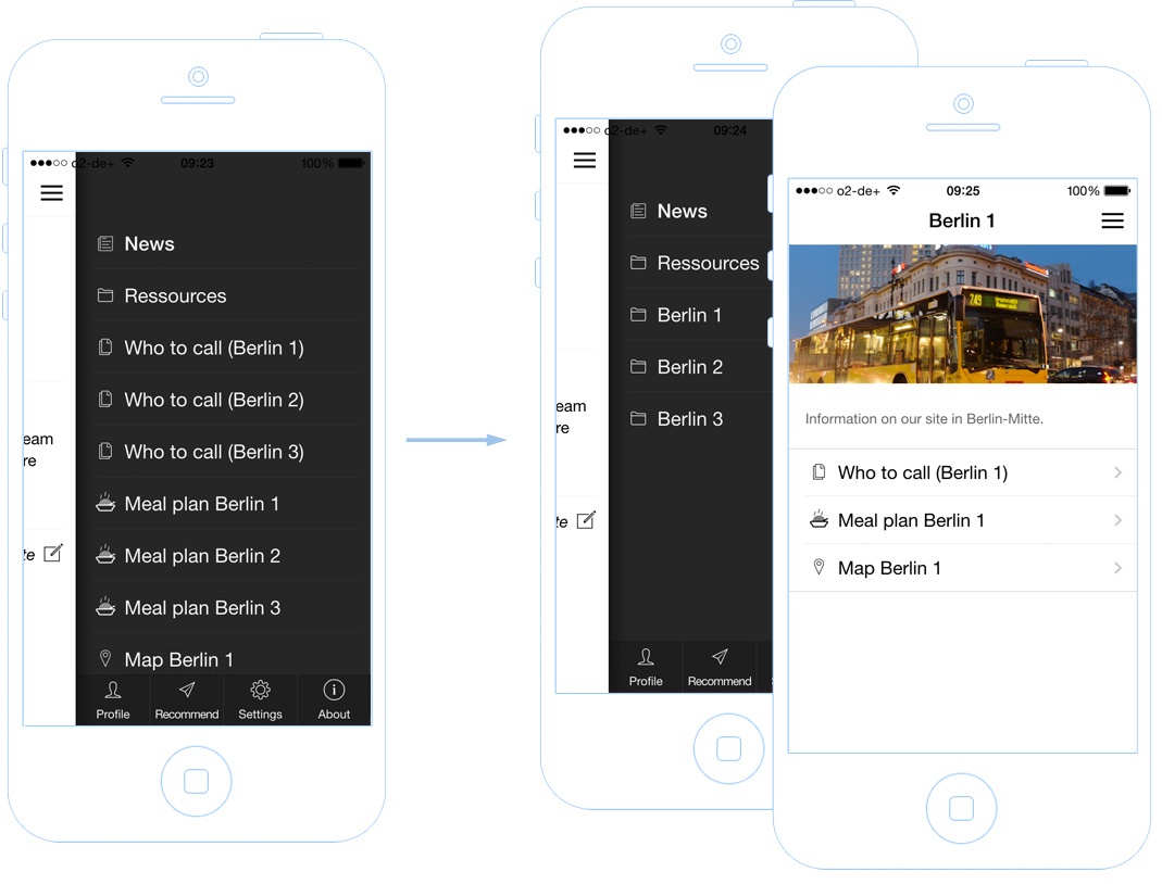
By default, new pages, the employee directory, the meal plan and everything else you add to your employee app is shown in a flat list in the sidebar of the app. As soon as you have more than just a few menu entries you’ll want to add more structure. That’s what custom navigation is for. You can sort all entries and also add folders to the side bar. Example: Let’s say you have three locations and for each location you have a page for “who to contact”, a meal plan and a map. With a custom navigation you can group those contents into three folders:

Custom Colors
In the branding editor you can easily change two color settings: 1) the color of the app’s header which is also used as background for buttons throughout the app. 2) the text color which is used for all text and icons inside the header and buttons. Typically you’d set the background color to your company’s main color and the text color to either black or white (depending on what looks best). We’ve also seen a lot of corporate designs which work best with a white header. If you need even more flexibility check out custom CSS:
Custom CSS
CSS is the standard way of describing the appearance of a web page or an app. Internally your employee app works with CSS and with our recently introduced “custom CSS” feature we give you direct access to change the default settings. Using this feature you can manipulate basically everything in the app. Examples would be colors, font types, font sizes, margins and horizontal lines.


