


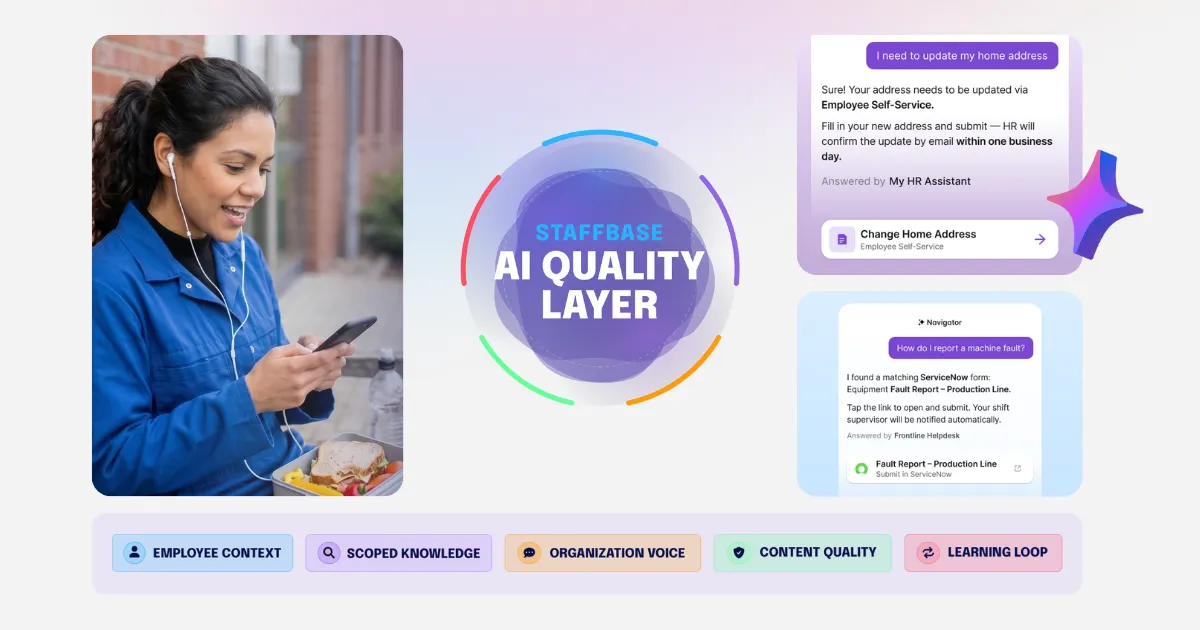
The AI Quality Layer: How to make sure AI actually works for every employee
An AI governance framework that makes sure AI actually works for every employee.
Read more
Connect people, content, and tools
Reach teams wherever they work
Send targeted internal emails
Publish once, reach everyone
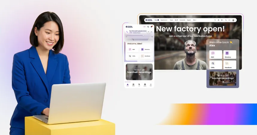
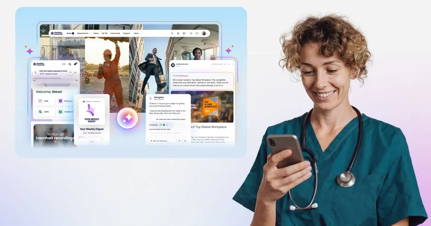
The right answer, every time
Onsite updates for your teams
AI-native content management
Personalized audio briefings
Town halls finally reach everyone

Employee experience, HR & internal comms
Insights and Inspiration for everyone in HR, IC, and IT that will help you foster an outstanding employee experience
An AI governance framework that makes sure AI actually works for every employee.
The best SharePoint alternatives aren't trying to replace SharePoint; they're solving a different problem. SharePoint is a way to build an intranet. The platforms in this article are a way to buy one. If your organization needs document management, file storage, and a place to organize internal resources, SharePoint belongs in your stack. But if you need to reach every employee[…]
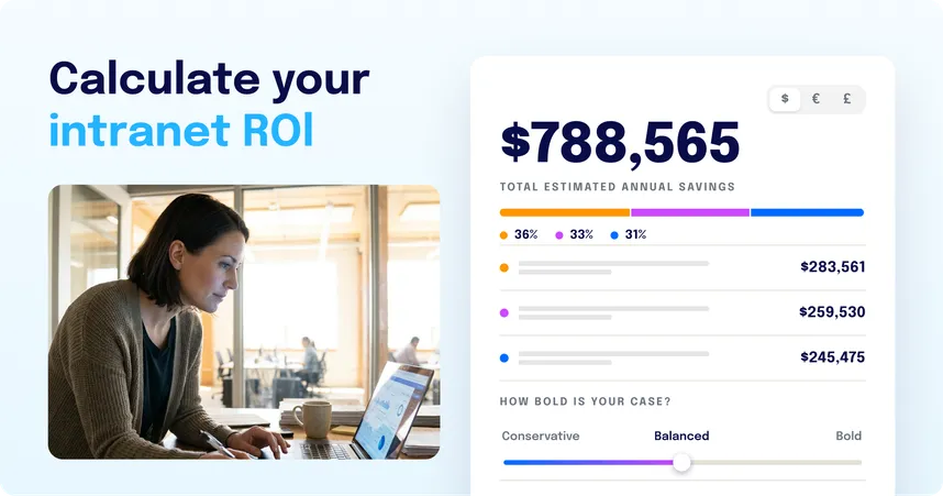
Learn how to calculate intranet ROI, build the business case for leadership, and see the value drivers most models miss — including the frontline reach they ignore.

An AI-powered EX platform improves how every employee accesses information, communicates, and works. The meaningful test isn’t whether a vendor claims AI — it’s whether AI is built into the architecture or bolted on.
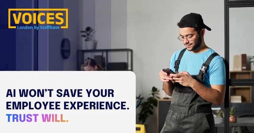
Governance, trust, and reach used to be separate conversations, with different owners, different tools, and different ways of measuring success. AI has brought them together. Once an AI layer sits between your content and your employees, you can't be trusted without being accurate, you can't be accurate without governing what the AI draws from, and none of it matters if it never reaches the people doing the work. At VOICES London, leaders from DHL, Cosentino and Kyowa Kirin weren't debating whether AI matters. They were working on what comes after that question: whether the answer that reaches an employee is actually any good.
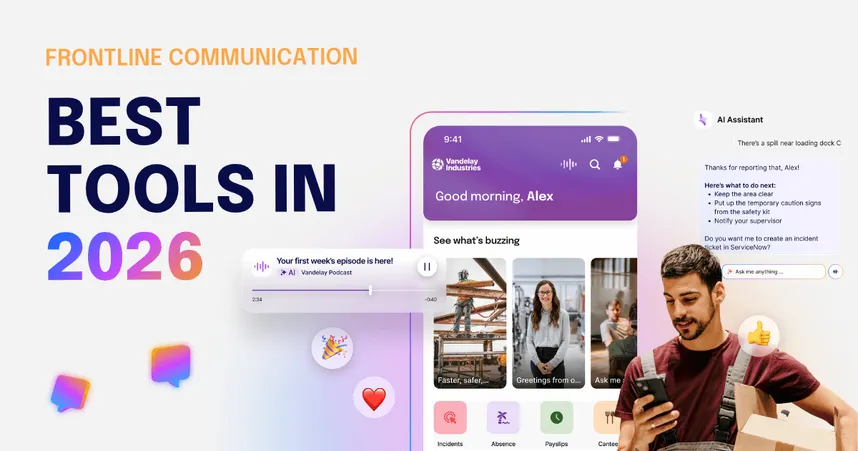
Compare the best frontline communication tools in 2026 by architecture, adoption, and analyst scores. Which platform fits your workforce now and in the future?
Compare the best employee experience platforms in 2026 by what they actually solve: communication, intranet, frontline reach, service delivery, listening, recognition and performance.

In an era defined by rapid digital transformation and economic volatility, the Executive Priorities for the Next Digital Workplace Era 2026 provides a critical analysis of how Australian organisations, particularly those within the ASX 100, are navigating the intersection of technology and human capital. The findings reveal a strategic paradox: while leaders are obsessed with digital growth, they are systematically under-prioritising the cultural foundations required to achieve it.

In the current landscape of rapid technological evolution, Australian organisations are facing a critical crossroads. The Executive Priorities for the Next Digital Workplace Era 2026 highlights a profound tension between aggressive digital transformation and the human elements required to sustain it. As leaders grapple with complexity, a new leadership paradigm is required to bridge the widening chasm between executive data and employee reality.

As we navigate the midpoint of the decade, a startling paradox has emerged in Australian boardrooms. According to the Executive Priorities for the Next Digital Workplace Era 2026, while Digital Transformation is cited as the top strategic priority for 18% of leaders, the very foundation required to sustain that change, People and Culture, has plummeted to the bottom of the list. It’s now prioritised by only 6% of executives

Staffbase and Unily both went AI-native in 2026. Unily uses AI to build intranet experiences faster. Staffbase uses AI to make trusted employee answers reach the whole workforce. Here's how to choose.

An AI governance framework that makes sure AI actually works for every employee.
Most organizations deploy AI in employee experience as a chatbot and wonder why adoption stalls. This guide explains what works, what fails, and what good looks like across the entire workforce.